Content Management
Create and manage Pages and Widgets for promoting Products on The Website.
Website Pages and Widgets
The Content Management section includes Pages and Widgets which can be added on The Website to promote Products and highlight ongoing sales offers. Shop Owners can create, edit, and publish Pages with Widgets to promote their Shop, Brands and Products. Particularly, non-technical people will find it easier to navigate the content management system to design their own Website pages to draw Customers towards their Shop.
Website Default and Custom Pages
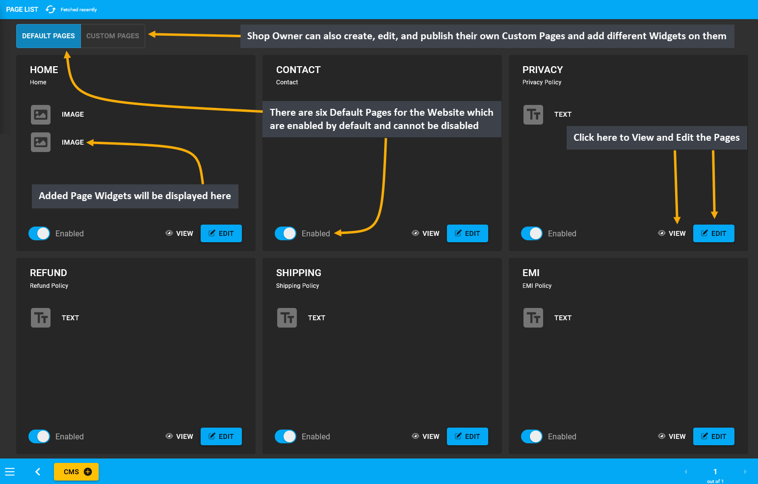
Therefore, when the Shop Owner will utilize the Content Management section to make changes to their Website, they can quickly do it with the help of Pages and Widgets. The Pages section usually consists of some pre-defined Default Pages, which can be edited by adding different Widgets. In the same way, the Shop Owner can also create, edit, and publish their own Custom Pages and add different Widgets on them that will fill up the Website.

Image 1: The six Default Pages for the Website are enabled by default and Custom Pages can also be added.
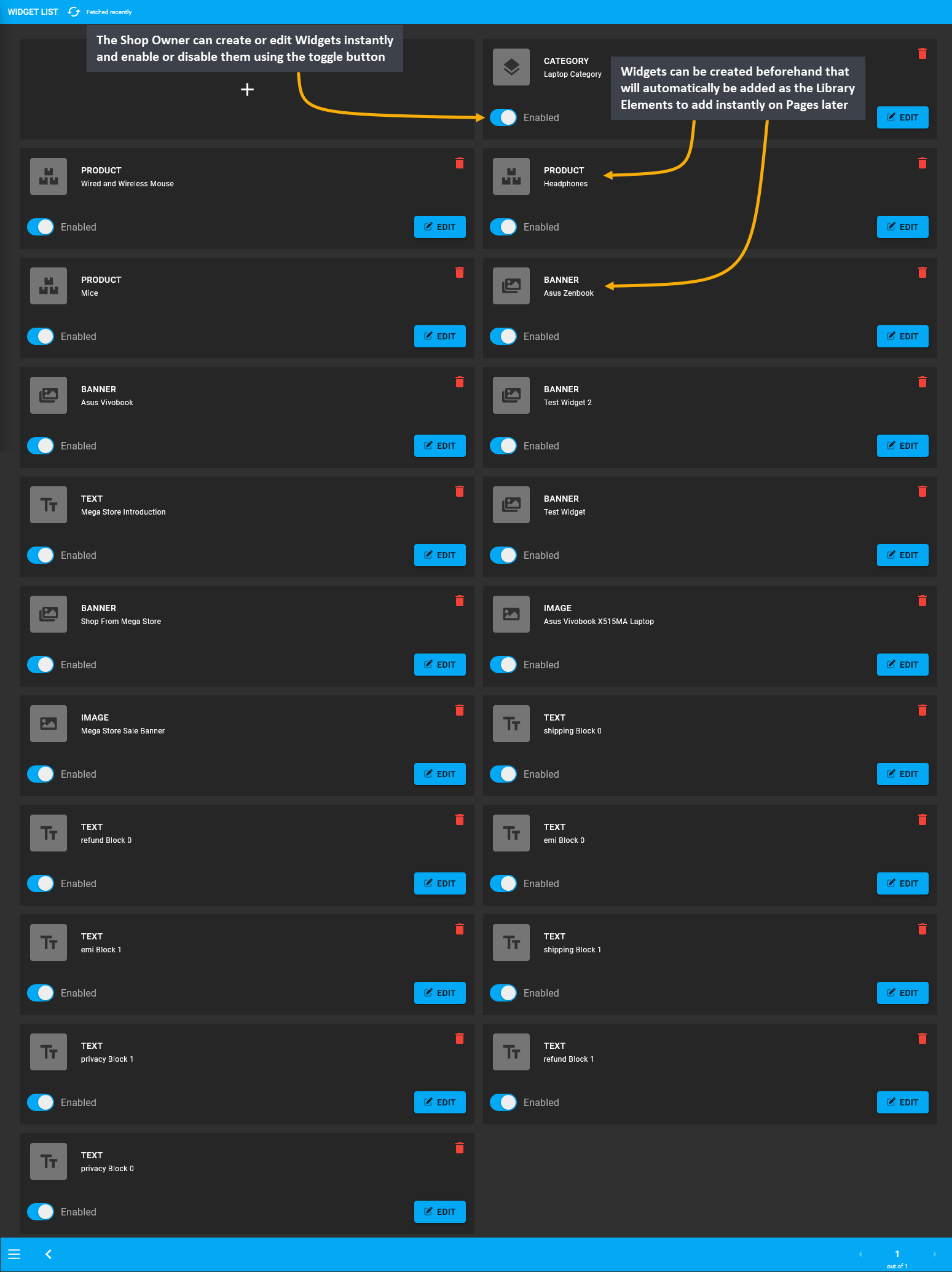
The Widgets section consist of five different Widgets types - Text Widget, Image Widget, Banner Widget, Product Widget, and Category Widget. These Widgets can be created beforehand that will automatically be added as the Library Elements. The Shop Owner can create or edit Widgets instantly and enable or disable them using the toggle button. Already created Widgets can be added instantly on different Pages from the Library Elements section.

Image 2: The six Default Pages for the Website are enabled by default and Custom Pages can also be added.
1 - Default Pages
Create and manage Pages for promoting the Shop and Products on The Website.
What are Pages?
Pages in The Website are documents that are commonly written in HTML formats. Each Page have a URL address which can be accessed by entering it into a Browser’s address bar. These Pages contain titles, subtitles, texts, call-to-action buttons, images, videos, and hyperlinks. The Shop Owner can utilize Default Pages by adding Widgets and make their own Custom Pages to sell or advertise Products to the Customers. Several Custom Pages can be created for different purposes such as giving a virtual welcome to the Visitors or telling a compelling story.
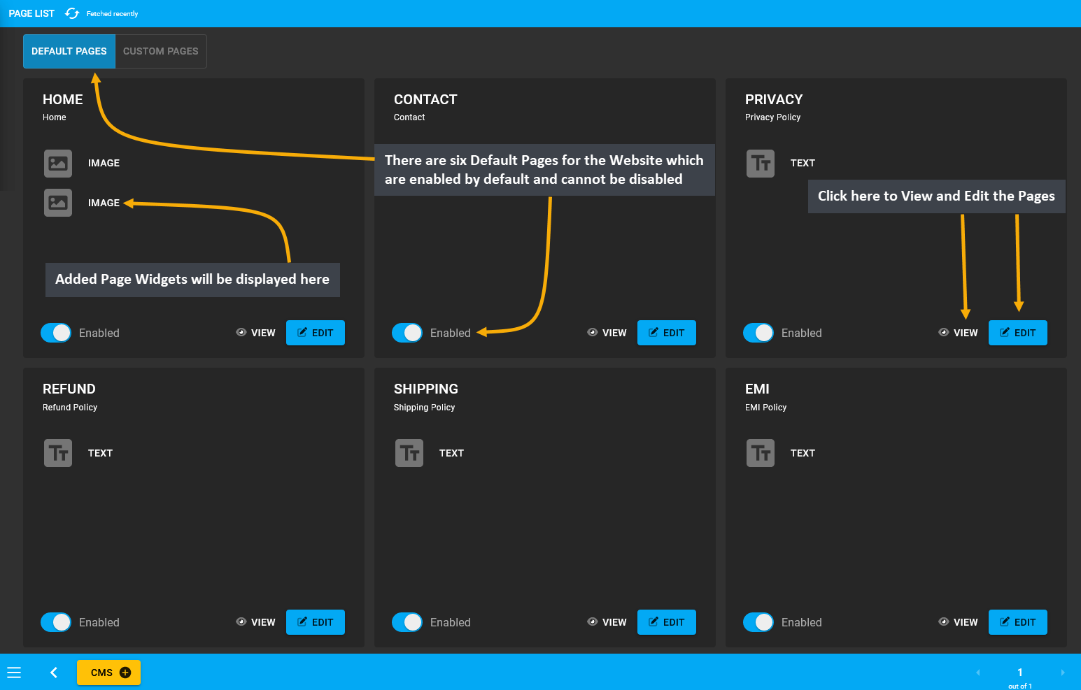
Generally, Default Pages will be displayed on the Page List. The Default Pages include the EMI Page with EMI Policy, Refund Page with Refund Policy, Shipping Page with Shipping Policy, Privacy Page with Privacy Policy, Home Page, and Contact Page with Contacts. They will remain enabled by default and cannot be disabled by Shop Owner.

Image 1: There are six Default Pages for the Website which are enabled by default and cannot be disabled.
Home Page
The Home Page is where all the actions happens and it is the first Page that the visitors will see. Therefore, how the Home Page is organized will determine if page visitors will turn into potential Customers. When crafting the Home Page, the Shop Owner should think from the Customers’ perspectives to create a first impression. Make sure to highlight the Shop Logo with a visible Call to Action button and Products listed with promotional prices.
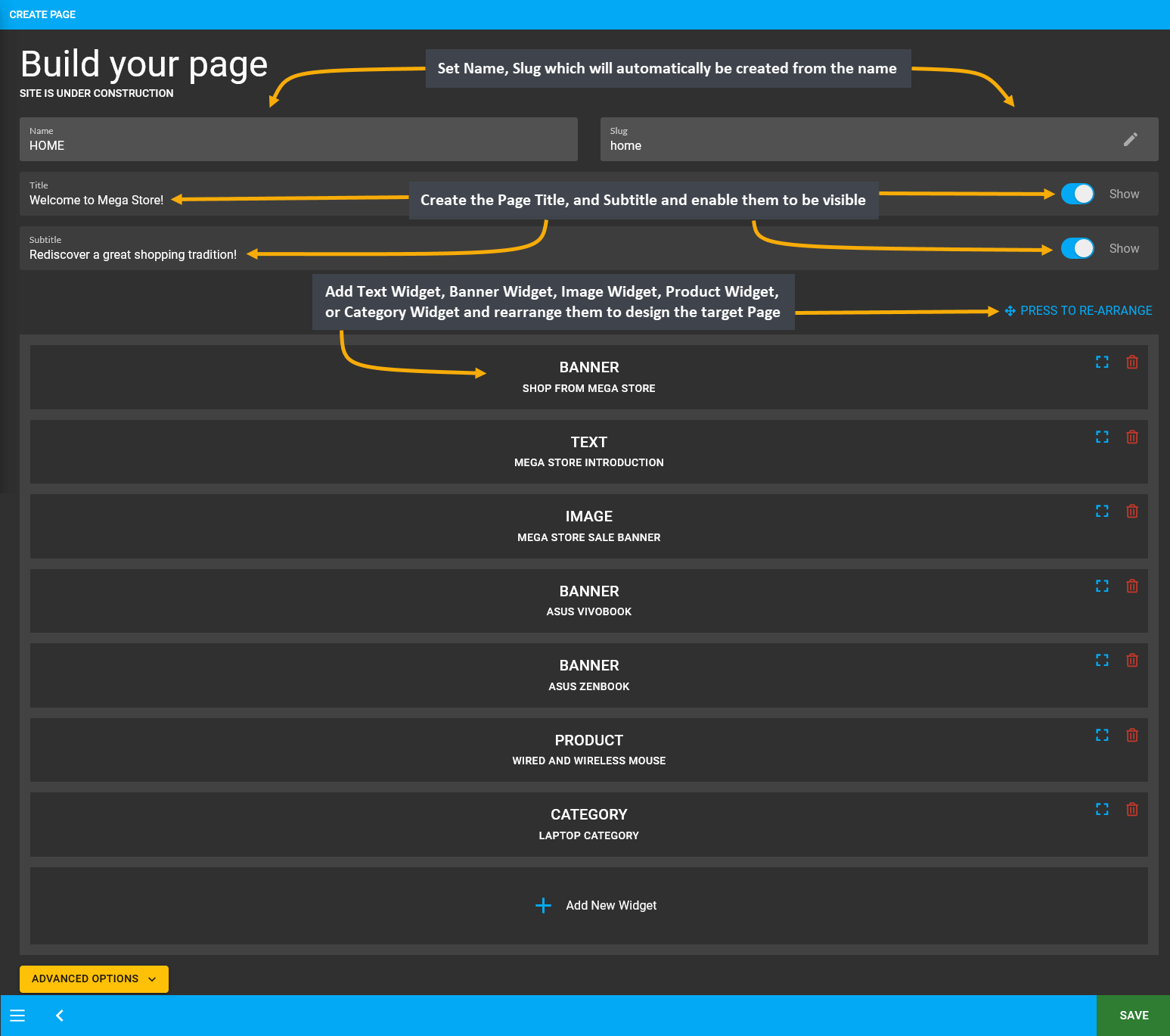
Build the Home Page by clicking Edit from Page List that will redirect to this page where details can be setup using Text Widget, Banner Widget, Image Widget, Product Widget, or Category Widget to make it promote the Shop and its Products. Set Name, Slug which will automatically be created from the name. Create the Page Title, and Subtitle and enable them to be visible. Then, add several Widgets and rearrange them to design the target Page.

Image 2: Setup Home Page with Text Widget, Banner Widget, Image Widget, Product Widget, or Category Widget.
A complete Home Page will not only look compelling to potential visitors but also guide daily Customers to check promotional offers and newest Products that the Shop Owner is selling. Exemplified below is a full Home Page.

Image 3: A complete Home Page will guide daily Customers to check promotional offers and newest Products.
Contact Page
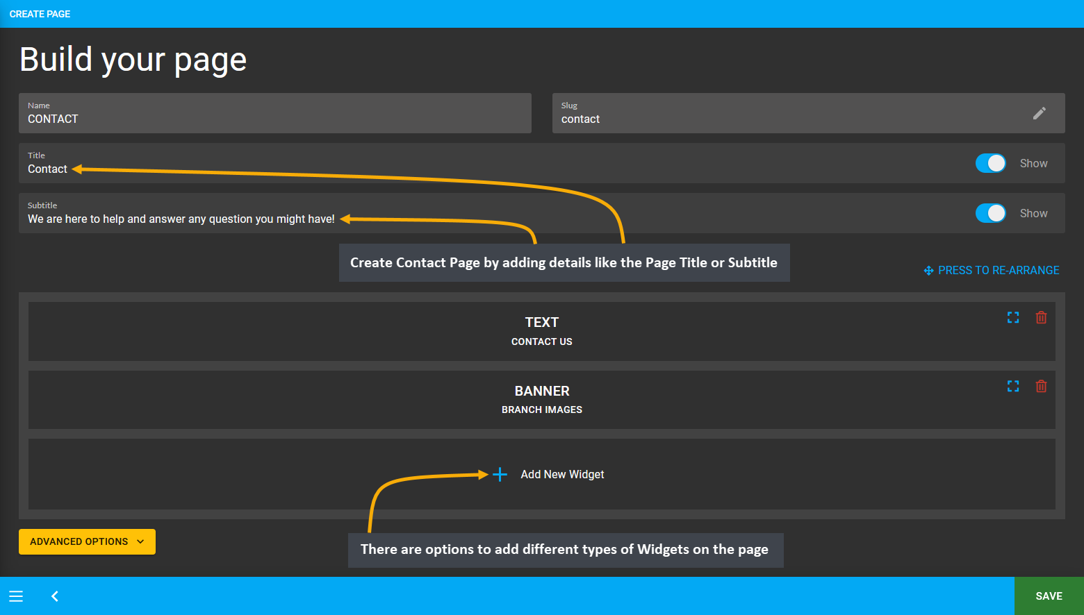
The Shop Owner should display their Contact Address, Email Address, and Phone Number on the Contact Page for Customers and Suppliers to reach out to them. If the Shop remains open on the weekdays and remains closed on the weekends, then it is better to show the Shop Opening Hours on the Contact Page for everyone’s convenience. Create Contact Page by clicking the Edit option from Page List that will redirect to this page where details like the Page title or subtitle can be setup. There are options to add Widgets on the page which is currently supported.

Image 4: Create Contact Page by adding details like the Page Title, Subtitle, and different Widgets types.
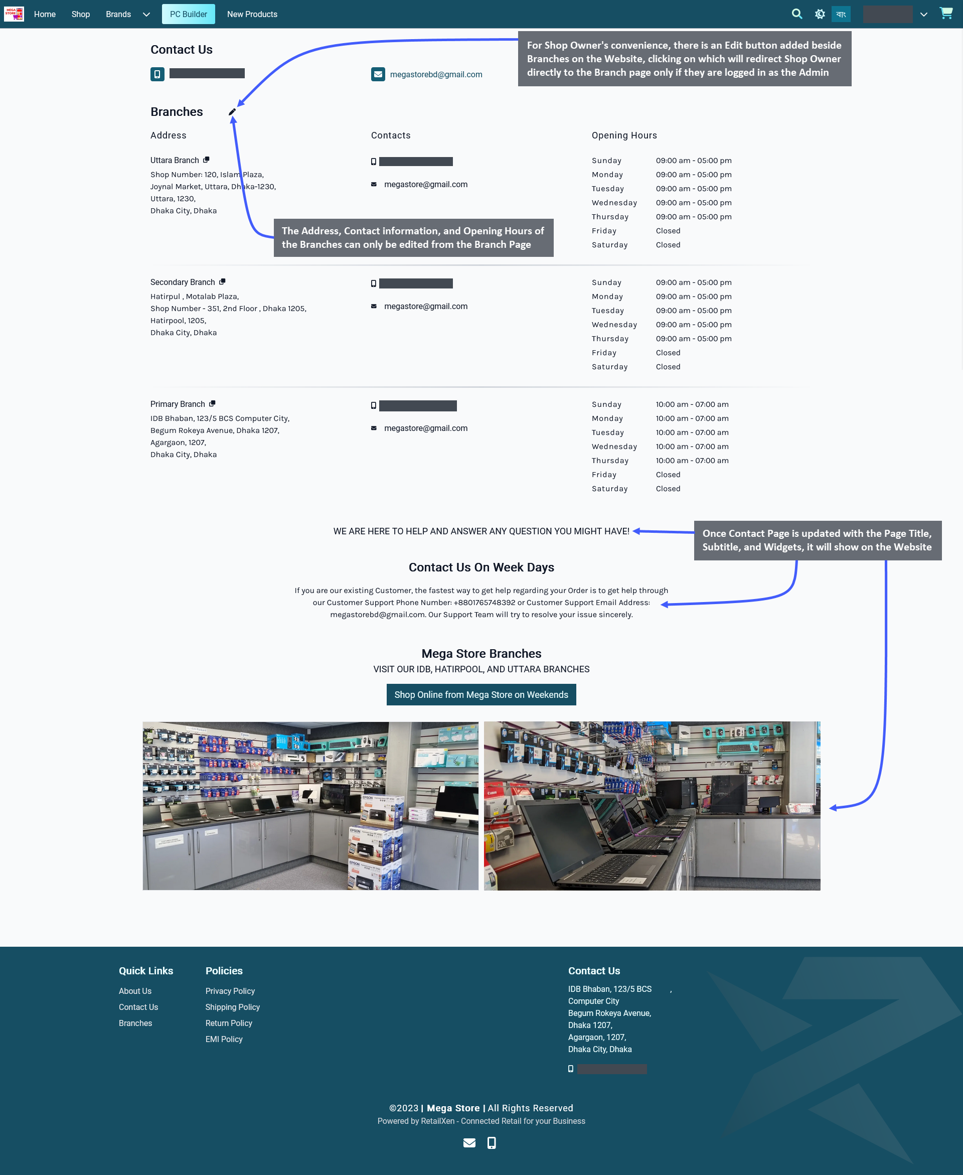
When Contact Page is updated by adding Widgets, the Shop Owner can visit the Website to view the edited Page. However, the Address, Contact information, and Opening Hours of the Branches can only be edited from the Branch Page. For the Shop Owner’s convenience, there is an Edit button added beside Branches on the Website, clicking on which will redirect the Shop Owner directly to the Branch page only if they are logged in as Admin.

Image 5: Once Contact Page is updated with Page Title, Subtitle, and Widgets, it will show on the Website.
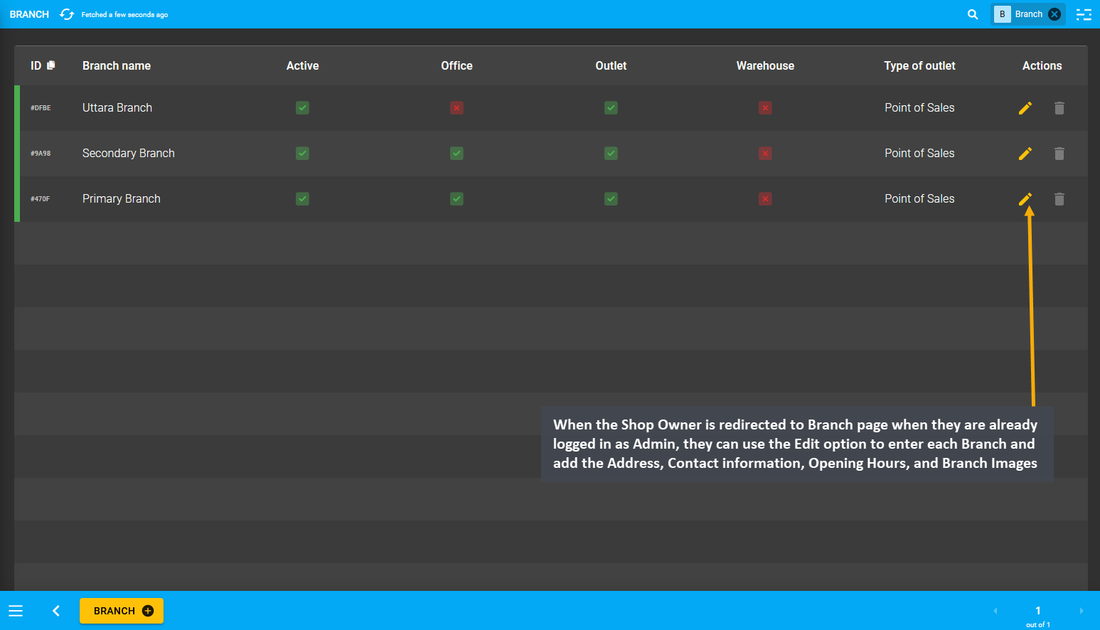
When the Shop Owner is redirected to the Branch page when they are already logged in as Admin, they can use the Edit option to enter each Branch and add the Address, Contact information, Opening Hours, and Branch Images.

Image 6: Shop Owner can edit Branch List after being redirected when they are already logged in as Admin.
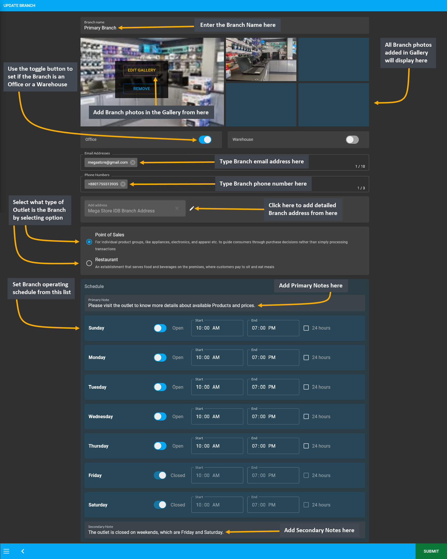
Clicking the Edit icon will let Shop Owner to edit individual Branches, where the first field to fill out for the Branch is the Branch Name. Below branch name is the Gallery where Shop Owner can add photos of their Branch outlets and add multiple images for Branch gallery. There are two toggle buttons to set Branch as Office or Warehouse. To best describe their Branch, the Shop Owner can select if their Outlet is a Point of Sales or Restaurant from below.
Fill out the email address, phone number, and detailed address of the Branch. Then, set Branch operating Schedule for Customers to visit or make Product purchase. Set business days and holidays with Start and End times. Use the toggle button to show when the Branch is open or closed. Add Primary Note or Secondary Note as needed.

Image 7: Shop Owner can edit Branch List after being redirected when they are already logged in as Admin.
Privacy Policy Page
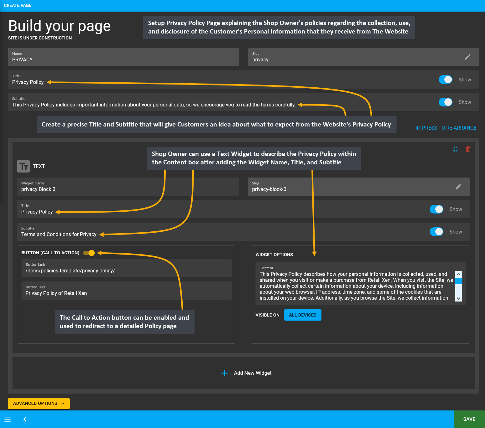
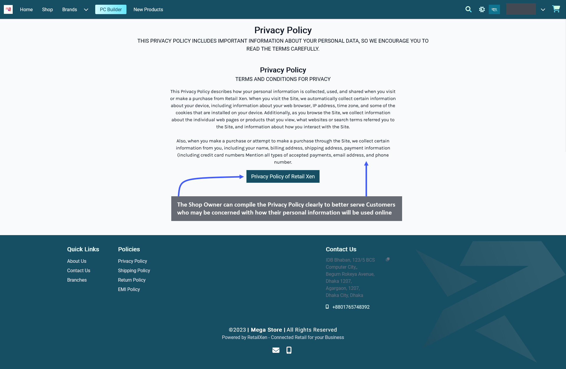
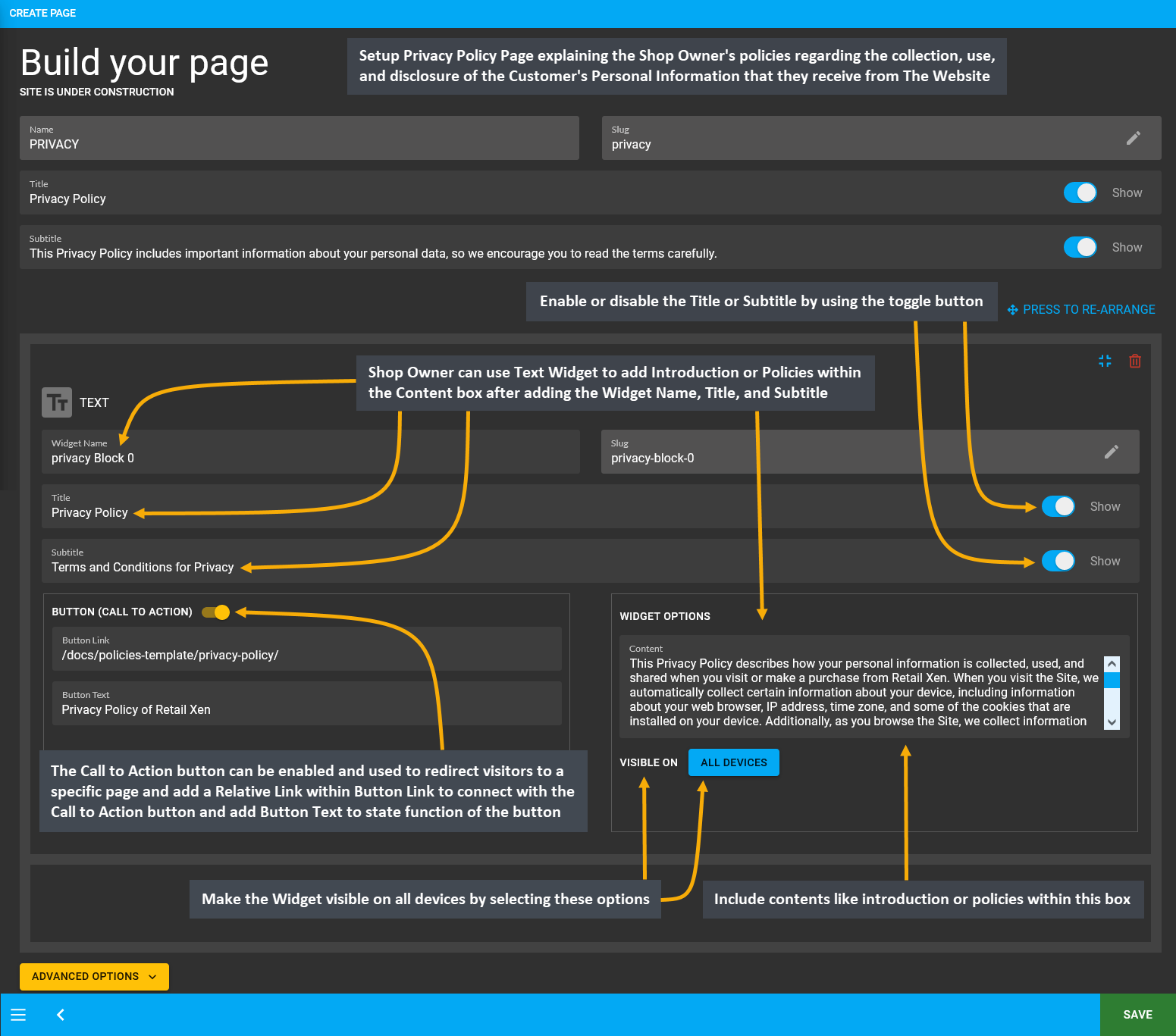
Setup the Privacy Policy Page explaining the Shop Owner’s policies regarding the collection, use, and disclosure of the Customer’s Personal Information that they receive from The Website. Build the Privacy Policy Page by clicking Edit from Page List that will redirect to this page where the details can be setup. The Shop Owner can compile the Privacy Policy clearly to better serve the Customers who may be concerned with how their personal information will be used online. Shop Owners can refer to this Privacy Policy Template to create their own Website policy.
The first step is to create a precise Title and Subtitle that will give Customers an idea about what to expect from the Website’s Privacy Policy as they register as Customers, provide their personal information and buy Products. If they are explaining the policy using a Text Widget, then they can describe the Privacy Policy within the Content box after adding Widget name, title, and subtitle. If they need to redirect Customers towards more information regarding Privacy Policy, they can enable and use the Call to Action button to redirect to a detailed policy page.

Image 8: Setup Privacy Policy Page explaining collection, use, and disclosure of Customer's information.

Image 9: The Shop Owner can compile the Privacy Policy on the Website to clearly explain information use.
Refund Policy Page
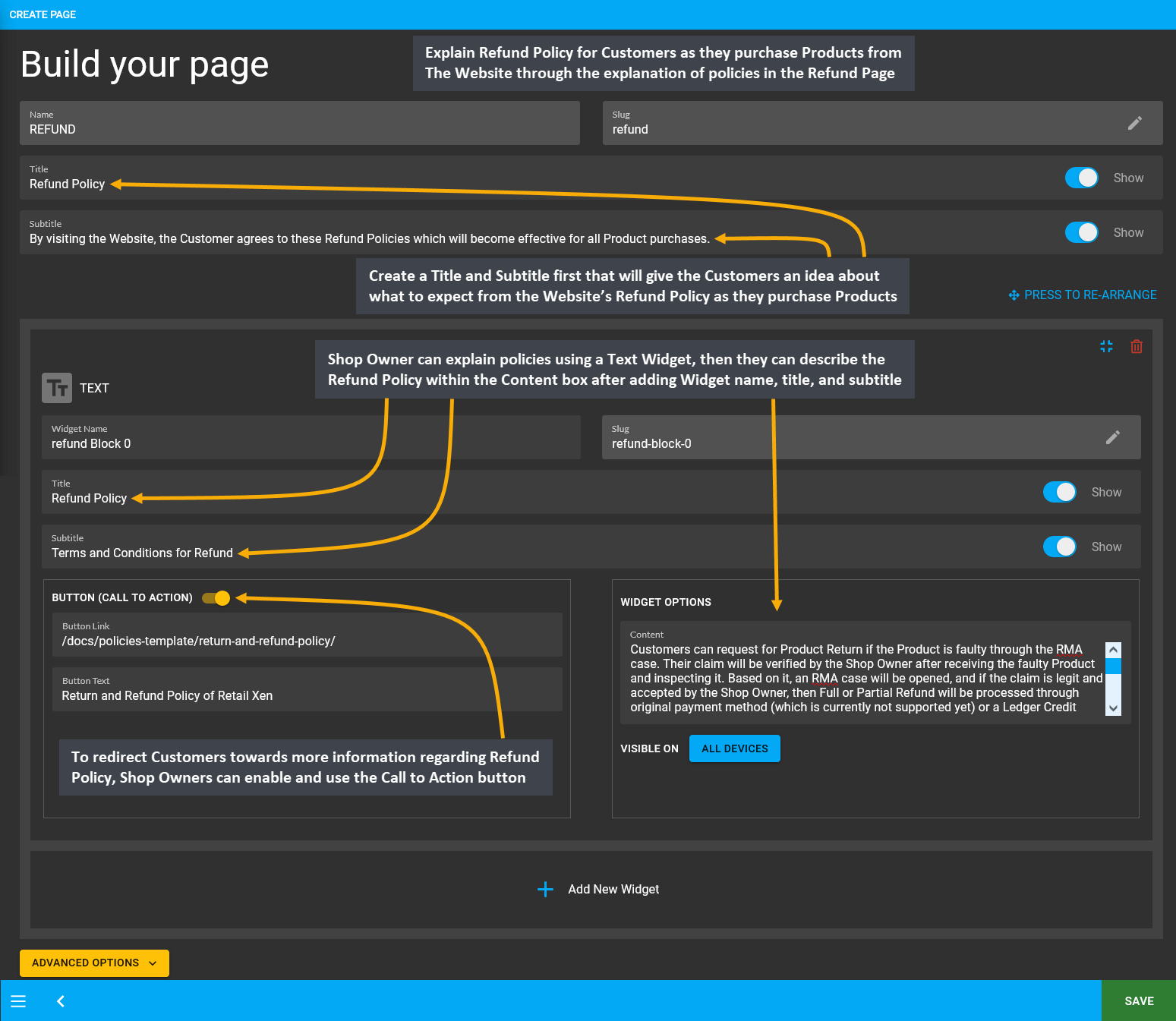
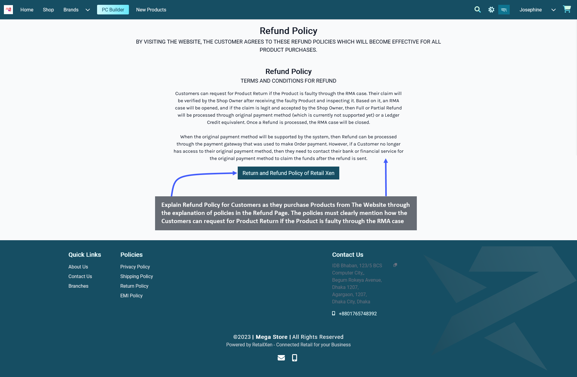
Explain the Refund Policy for Customers as they purchase Products from The Website through the explanation of policies in the Refund Page. The policies must clearly mention how the Customers can request for Product Return if the Product is faulty through the RMA case. Explain the procedure of the verification of Customer’s claim by the Shop Owner after opening the RMA case, and if the claim is accepted, then how the Full or Partial Refund will be processed through original payment method (which is currently not supported yet) or a Ledger Credit equivalent.
Setup the Refund Policy Page by clicking the Edit option from Page List that will redirect to this page. Create a Title and Subtitle first that will give the Customers an idea about what to expect from the Website’s Refund Policy as they purchase Products. If they are explaining the policies using a Text Widget, then they can describe the Refund Policy within the Content box after adding Widget name, title, and subtitle. If they need to redirect the Customers towards more information regarding Refund Policy, they can enable and use the Call to Action button to redirect to a detailed policy page. Shop Owners can refer to this Refund Policy Template to create their Website policy.

Image 10: Setup Refund Policy Page explaining Refund procedure that will follow from RMA case resolution.

Image 11: The Shop Owner can compile the Refund Policy on the Website to clearly explain Refund procedures.
Shipping Policy Page
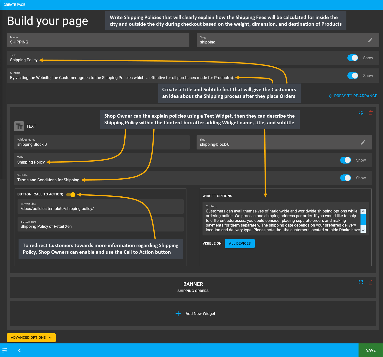
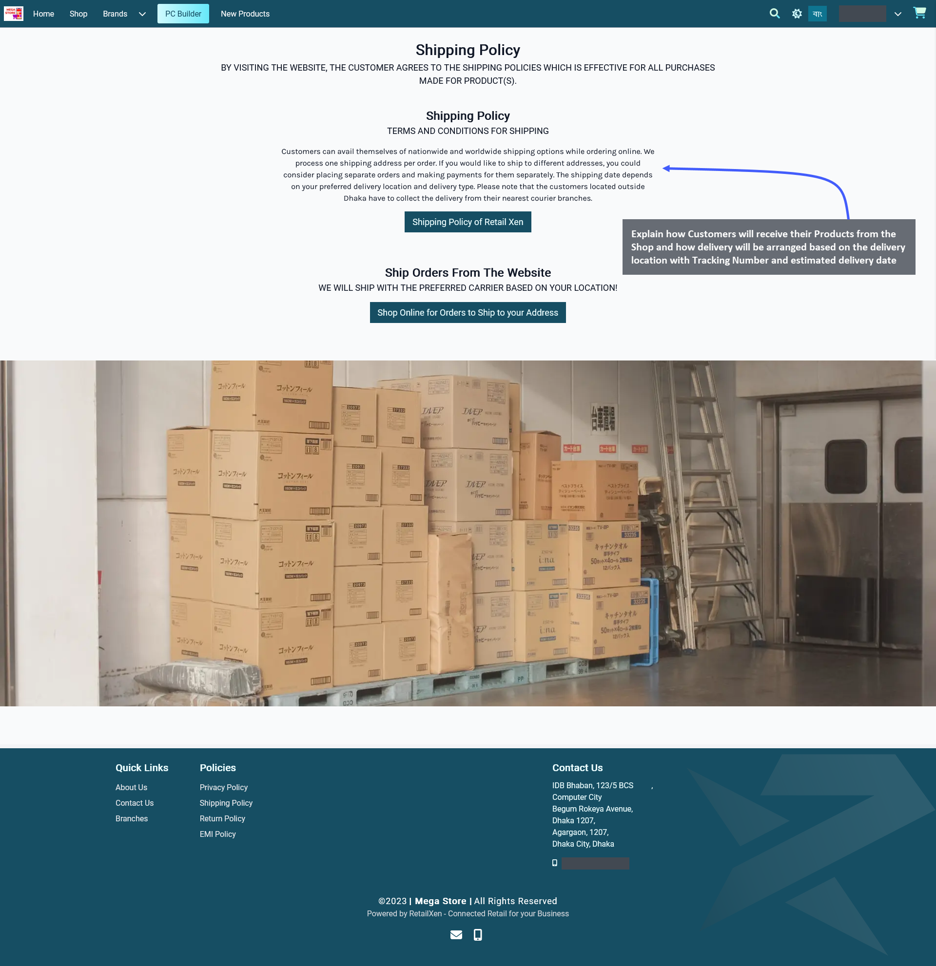
Setup Shipping Policy Page by describing the Shipping Policies for Customers which will explain how they are going to receive their Products from the Shop Owner. Explain how the Shipping Fees will be calculated for inside the city and outside the city during checkout based on the weight, dimension, and destination of Products. Elaborate how delivery will be arranged based on the delivery location with Tracking Number and estimated delivery date.
Edit the Shipping Policy Page by clicking the Edit option from Page List that will redirect to this page. Create a Title and Subtitle first that will give the Customers an idea about the Shipping process after they place Orders. If they are explaining the policies using a Text Widget, then they can describe the Shipping Policy within the Content box after adding Widget name, title, and subtitle. If they need to redirect the Customers towards more information regarding Shipping Policy, they can enable and use the Call to Action button to redirect to a detailed policy page. Shop Owners can refer to this Shipping Policy Template to create their Website Shipping policy.

Image 12: Setup Shipping Policy Page explaining Shipping process and how Shipping Fees will be calculated.

Image 13: Explain how Customer will receive their Products from the Shop and how delivery will be arranged.
EMI Policy Page
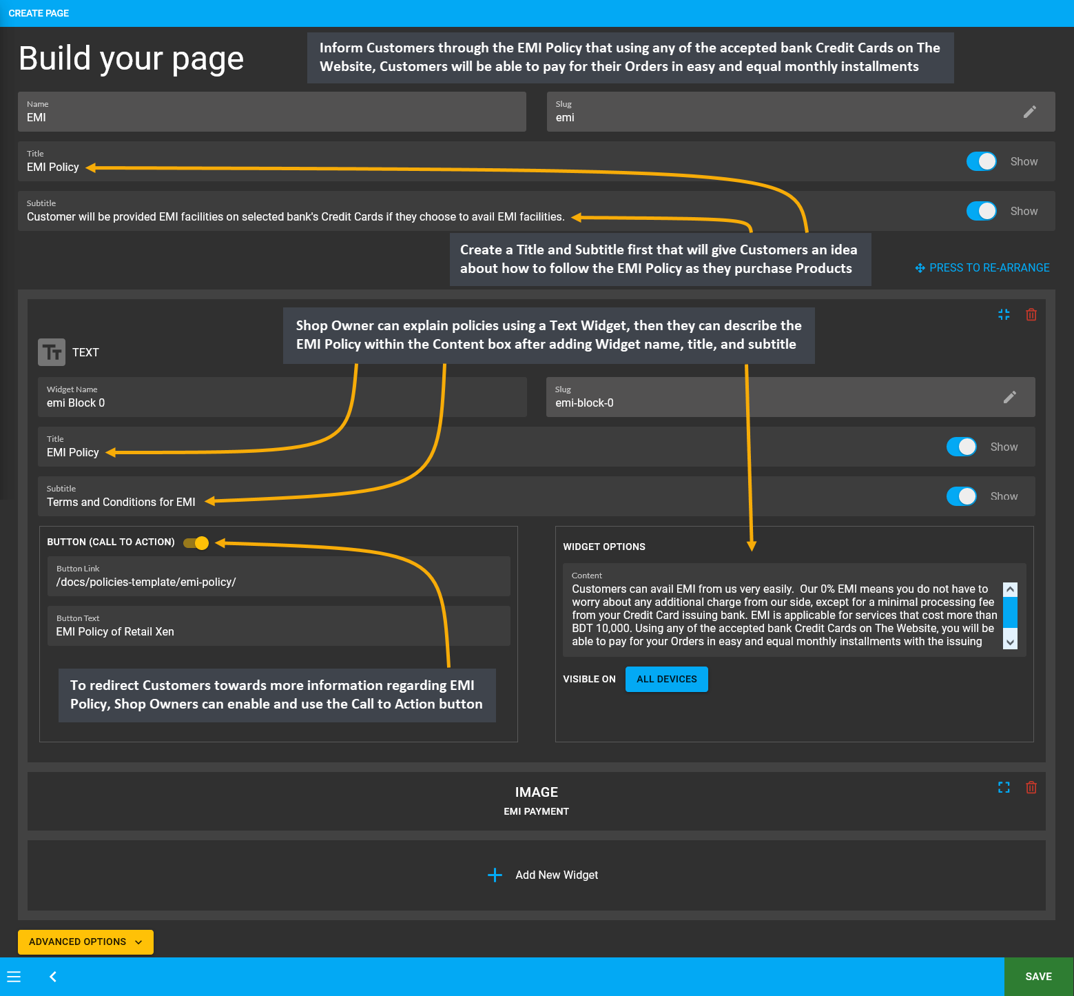
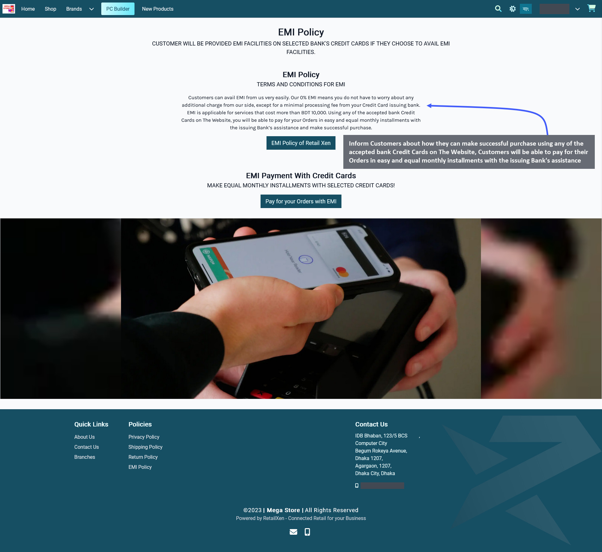
Customers may often feel reluctant to purchase expensive Products from The Website if they do not have option to place Order with installments. With EMI facilities, Customers will feel comfortable to purchase Products of any value and select their preferred payment terms. EMI Policy Page will give them idea on how to make the purchase through EMI. Using any of the accepted bank Credit Cards on The Website, Customers will be able to pay for their Orders in easy and equal monthly installments with the issuing Bank’s assistance and make successful purchase.
Setup the EMI Policy Page by clicking the Edit option from Page List that will redirect to this page. Create a Title and Subtitle first that will give the Customers an idea about how to follow the EMI Policy as they purchase Products. If explaining the policies using a Text Widget, then describe the EMI Policy within the Content box after adding Widget name, title, and subtitle. Enable and use the Call to Action button to redirect Customers to a detailed policy page. If needed, the Shop Owners can refer to this EMI Policy Template to create their own Website EMI policy.

Image 14: Setup EMI Policy Page explaining how the Customers can make their Product purchase through EMI.

Image 15: Explain how the Customers can purchase their Product by selecting the EMI policy to make payment.
2 - Widgets
Create and manage Widgets for promoting the Shop and Products on The Website.
Click the Content Management module to create Pages with five different types of Widgets for The Website.
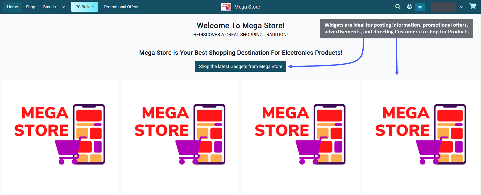
Widgets are small functional blocks or applications that are embedded into the body of The Website Pages. In the Website Shop Page, they are ideal for posting important information, promotional offers, and advertisements of Products. For instance, the Shop Owners can setup Widgets on both Default Pages and Custom Pages to direct the Customers to shop for their Products. Widgets can appear on one Page or on multiple Pages on The Website.

Image 1: Widgets are best for posting offers, advertisements, and directing Customers to shop for Products.
In the Retail Xen CMS, there are five different types of Widgets available: Banner, Product, Category, Text, and Image Widgets. Widgets will add features and functionality to the Shop Owner’s Website. For example, a Banner Widget can introduce the Brand Logo of the Shop, an Image Widget can be used to announce promotional offers or Shop advertisement, a Text Widget can display an introduction about the Shop, a Product Widget can list all the selected Products for sale, and a Category Widget can list all types of pre-defined Product Categories from the system. Each Widget has its own function to promote Products or advertise the Shop, so setup Widgets accordingly on Pages.
Add Widgets on Home Page
Using the CMS, Shop Owners can customize Home Page with Widgets. It will allow them to decide on what should appear in each section of their Home Page. The same type of Widget can be used multiple times on a same page. In the following example, different Widget types have been used with Call to Action buttons to direct Customers.

Image 2: Five different types of Widgets are available: Banner, Product, Category, Text, and Image Widgets.
3 - Custom Pages
Create and manage Pages for promoting the Shop and Products on The Website.
Create Custom Pages
Shop Owners can make their own Custom Pages to sell or advertise Products to Customers. Several Custom Pages can be created for different purposes such as welcoming Visitors to the Shop, highlighting promotional offers, or showcasing new Products. Custom Pages can be created as additional Pages on The Website to show promotional offers, limited edition Product pages, or advertisements of new Shop branches etc. A Custom Page include Titles, Subtitles, Texts, Call to Action buttons, images, banners, Products, and hyperlinks within the added Widgets.
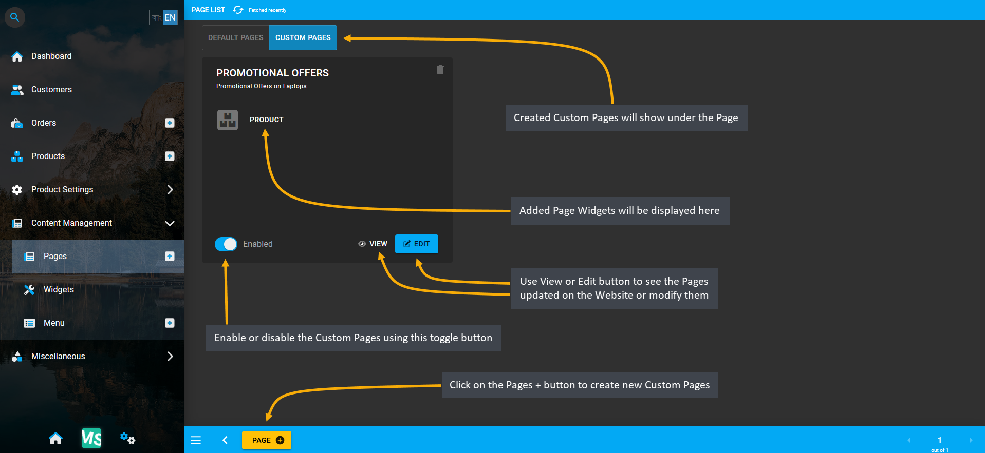
Within the Page List, Custom Pages can be accessed from the tab beside Default Pages. The newly created Custom Pages will be under this tab and there is a toggle button to enable or disable the pages. Use View or Edit button to see the Pages updated on the Website or modify them. Add several Widgets on Custom Pages to decorate them.

Image 1: Shop Owners can make their own Custom Pages on Website to sell or advertise Products to Customers.
Steps to Create Custom Pages
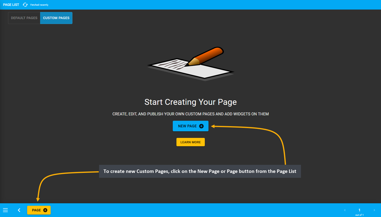
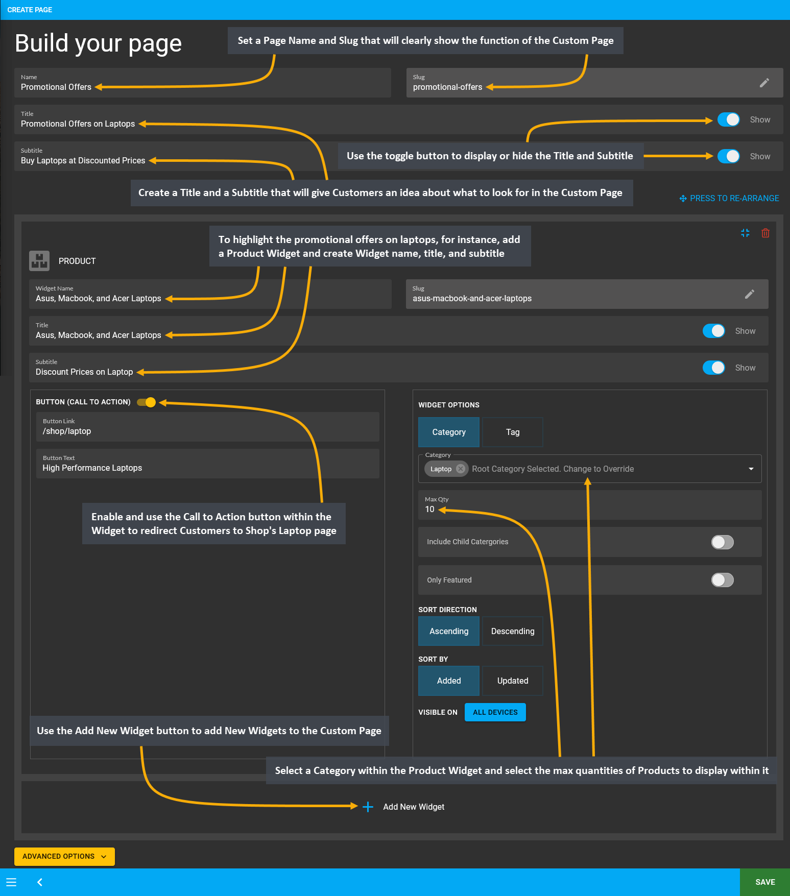
To create new Custom Pages, click on the New Page or Page button from the Page List. This will redirect to Create Page, where the Custom Page can be built with the following configurations. First, set a Page Name and Slug that will clearly show the function of the Custom Page. Then, create a Title and Subtitle that will give the Customers an idea about what to look for in the Custom Page. To display or hide the Title and Subtitle, there is a toggle button which can be enabled or disabled to display or hide the Title or Subtitle on the Custom Page.
To highlight the promotional offers on laptops, for instance, add a Product Widget and create Widget name, title, and subtitle. Enable and use the Call to Action button within the Widget to redirect Customers to Shop’s Laptop page. Select a Category within the Product Widget and select the max quantities of Products to display within it.
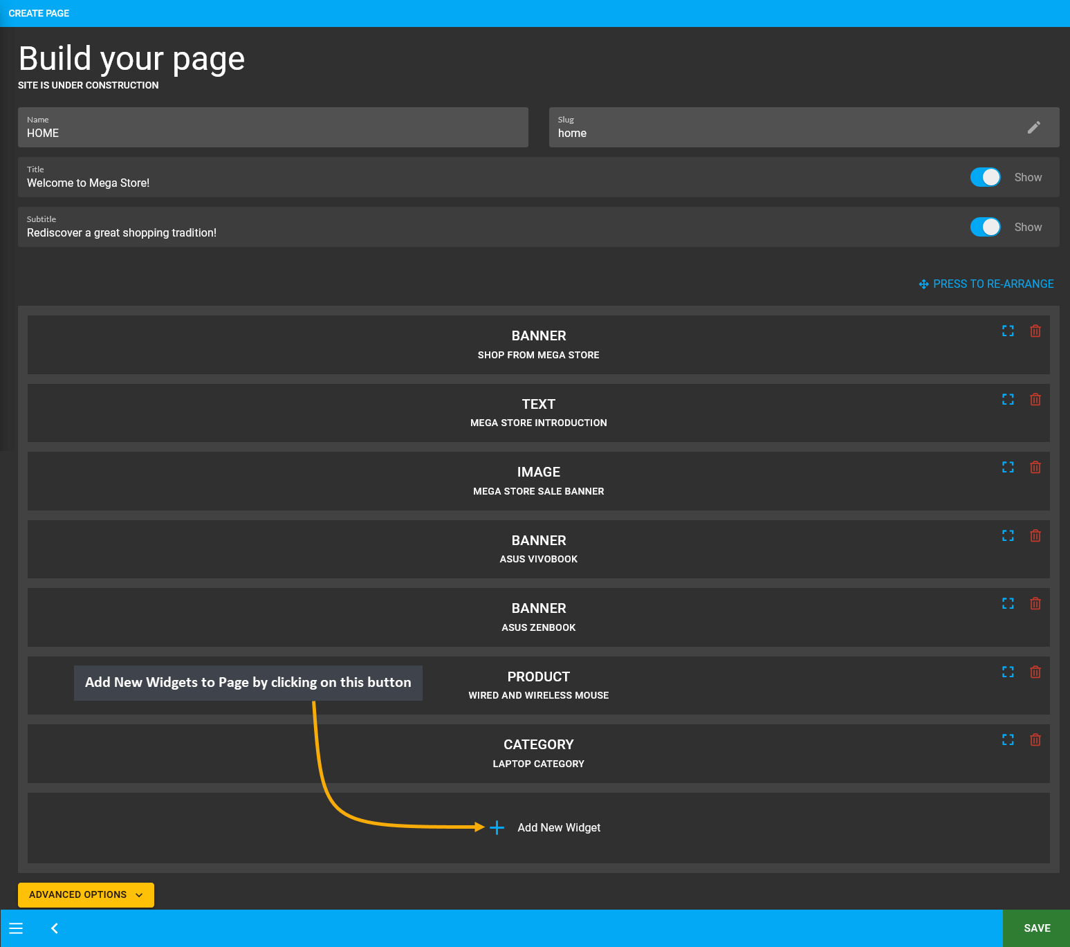
Several Widgets can be added to customize the Page like this. Existing Widgets will show from the top to bottom and below it, there will be an Add New Widget button using which New Widgets can be added to the Custom Page. At the bottom of the page, there is an Advanced Options to set Refresh Frequency for automatic page refreshing.

Image 2: Create New Custom Pages by clicking the New Page or Page button that will redirect to Create Page.

Image 3: Setup Custom Page with Title, Subtitle, and Widgets that will highlight what the Page is about.
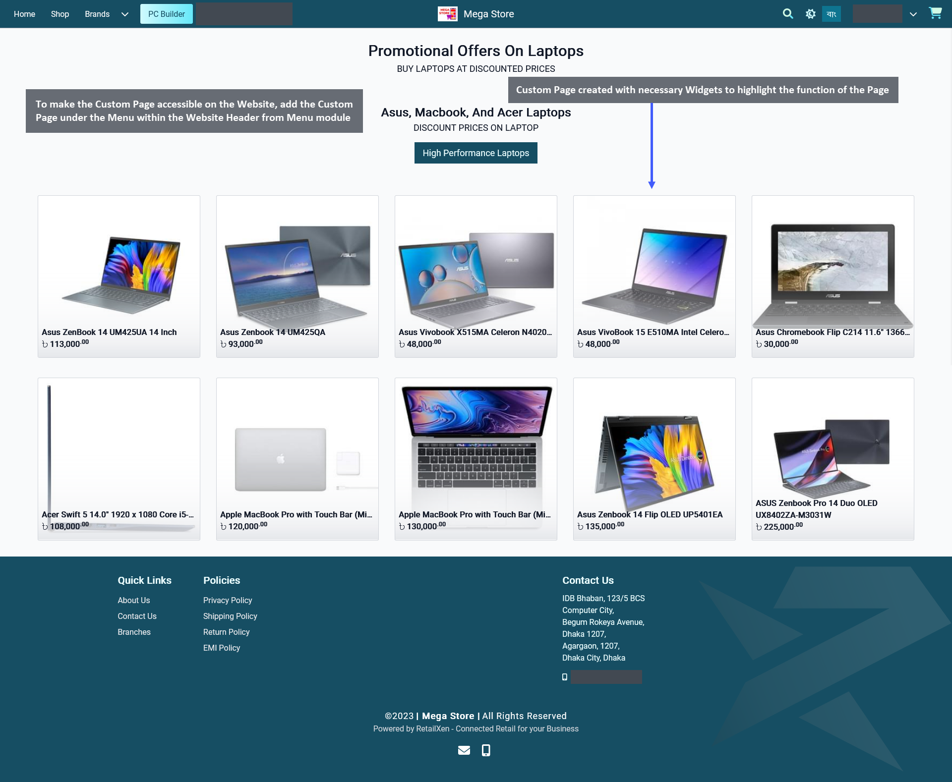
When all the customization is done for the Custom Page, click Save to proceed with the changes. After saving the changes, a pop-up message will show with a View button to check the new Custom Page created, click on it. This will redirect to the Custom Page that was created with necessary Widgets. To make the Custom Page accessible on the Website, add the Custom Page under the Menu within the Website Header using the Menu module.

Image 4: To make Custom Page accessible on the Website, add the Page under the Menu within Website Header.
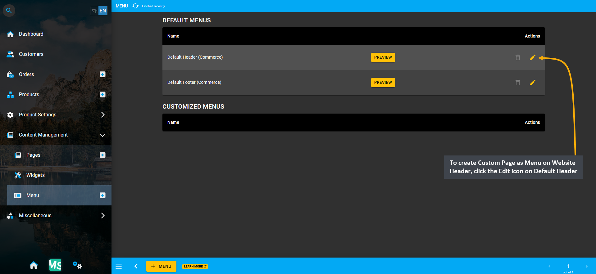
Create a Custom Page Menu on the Website Header for the page to be accessible on the Website. To perform this action, go to the Menu module from Content Management. Here, click the Edit icon on Default Header (Commerce). Using this option, Shop Owners can create Menu within Default Header and display the Custom Page created.

Image 5: To create Custom Page as Menu on Website Header, click the Edit icon on Default Header (Commerce).
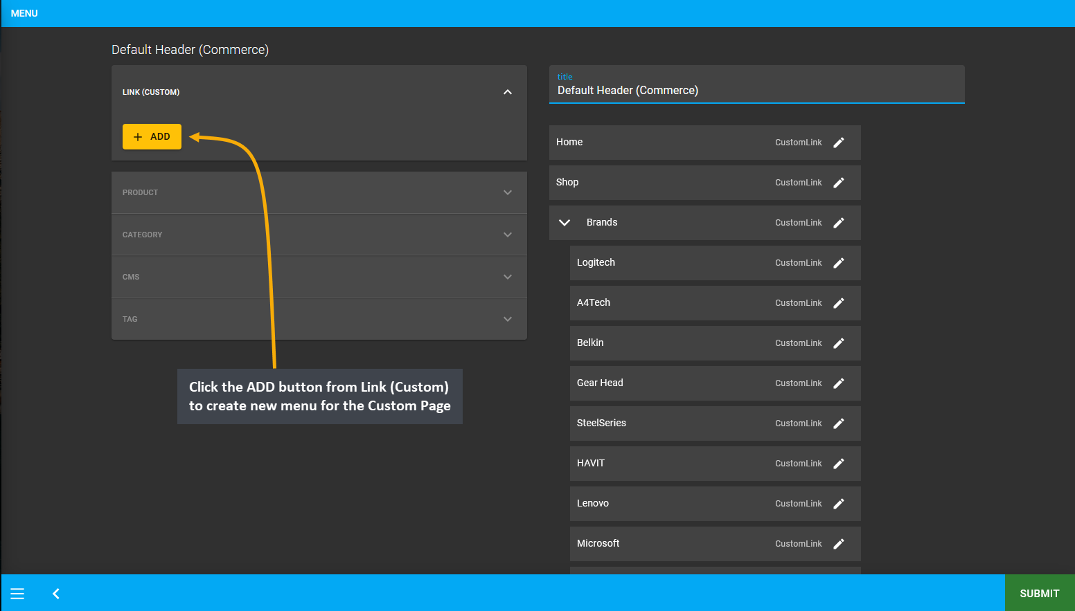
From the Default Header (Commerce) menu, click the ADD button from Link (Custom) to create new menu for the Custom Page. Clicking ADD button will allow Shop Owner to create a Menu for Custom Page on Website Header.

Image 6: Click the ADD button from Link (Custom) to create new menu for the Custom Page for Website Header.
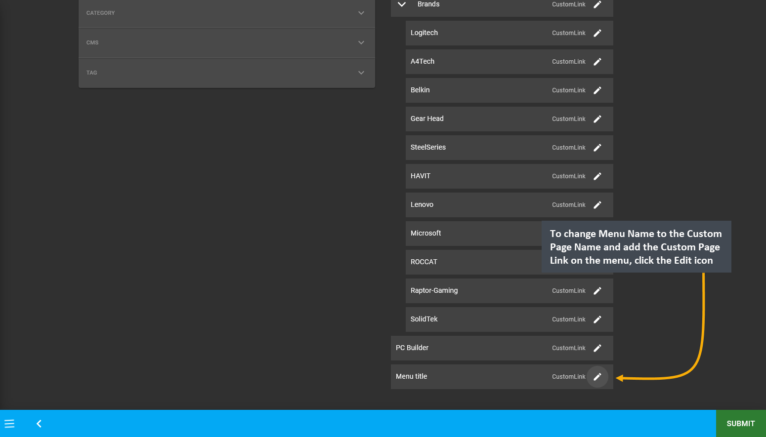
When the New Menu is created, it will appear under the List of menus within the Default Header (Commerce). Now, to change Menu Name to the Custom Page Name and add the Custom Page Link on the menu, click the Edit icon.

Image 7: To change Menu Name to Custom Page Name and add Custom Page Link on the menu, click the Edit icon.
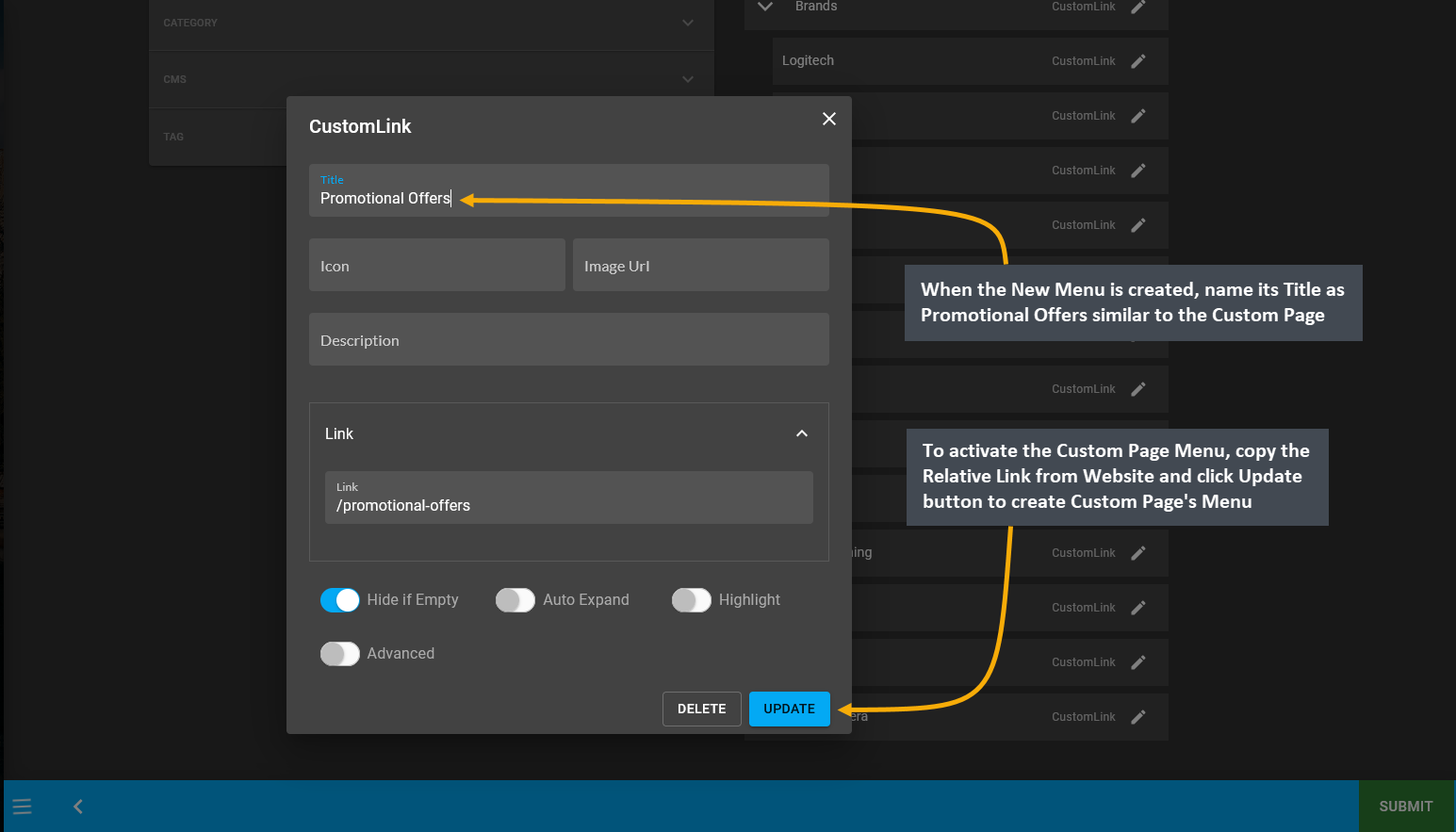
After creating the New Menu, click its Edit button and a pop-up will appear to edit the details of the menu. When the New Menu is created, name its Title as Promotional Offers similar to the Custom Page name. To activate the Custom Page Menu, copy the Relative Link from Website and click Update button to create Custom Page’s Menu.

Image 8: Edit the Custom Page Menu by clicking the Edit button and name the Title and the Link on pop-up.
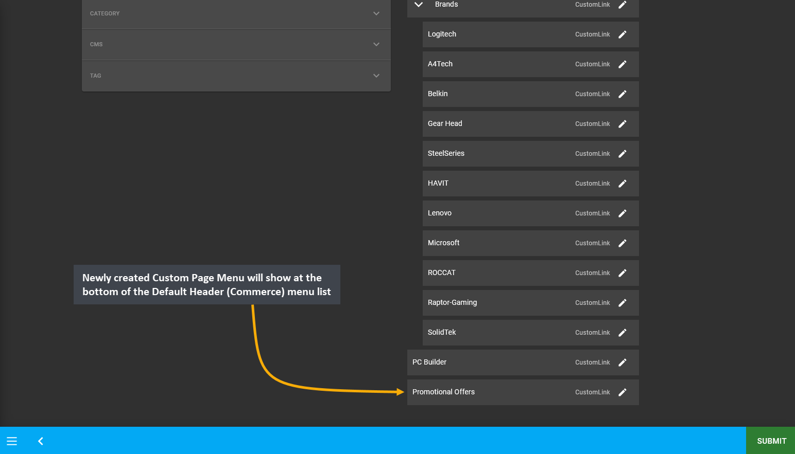
The newly created Custom Page Menu will now show at the bottom of the Default Header (Commerce) menu list.

Image 9: Newly created Custom Page Menu will show at the bottom of the Default Header (Commerce) menu list.
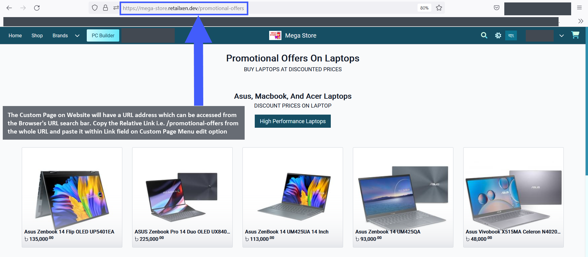
Retrieving the Relative Link from the Custom Page on Website can be done in a few simple steps. First, try to Edit the Custom Page from Page List and click Save which will show a pop-up with a VIEW button to check the updated Custom Page. So, clicking the VIEW button will open the Custom Page on Website and they will have a URL address which can be accessed from the Browser’s URL search bar. Copy Relative Link /promotional-offers from the whole URL https://mega-store.retailxen.dev/promotional-offers and paste it within Link field on Custom Page Menu.

Image 10: Copy Relative Link from Browser's URL search bar and paste it within Link field on Menu Edit.
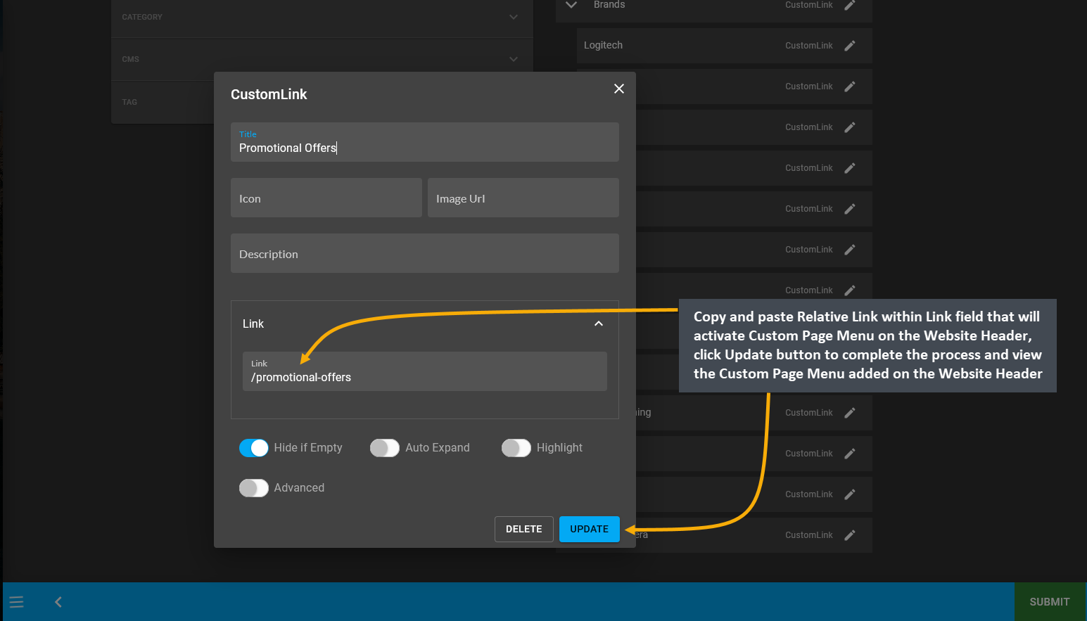
Therefore, simply copying and pasting the Relative Link within the Link field on Custom Page Menu’s editing pop-up window will activate the Custom Page Menu on the Website Header, click Update to complete the process.

Image 11: Copy-paste Relative Link within Link field that will activate Custom Page Menu on Website Header.
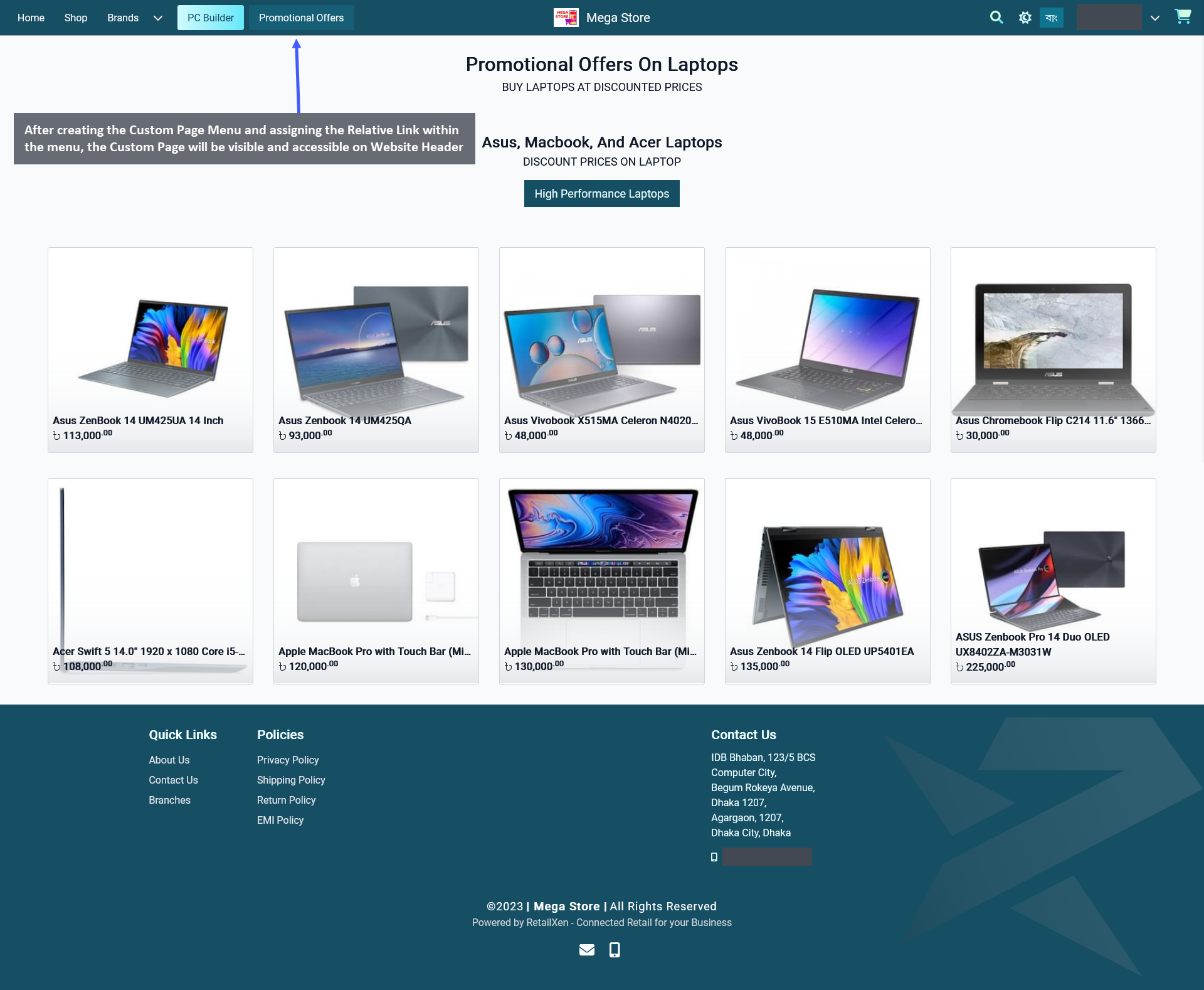
After creating the Custom Page Menu and assigning the Relative Link within the menu, the created Custom Page will be visible and accessible on the Website Header. So, Shop Owner can add more Custom Pages on Website like this.

Image 12: Custom Page will be visible on the Website after assigning Relative Link within Custom Page Menu.
Add New Widgets to Page
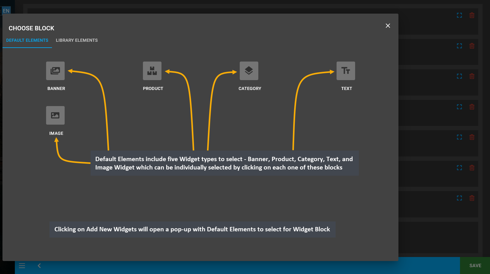
To add New Widgets to a Page, click on the Add New Widget Button which will redirect to a new pop-up containing the Default Elements. Default Elements include five Widget Blocks types - Banner Widget, Product Widget, Category Widget, Text Widget, and Image Widget which can be individually selected by clicking on each one of these blocks.
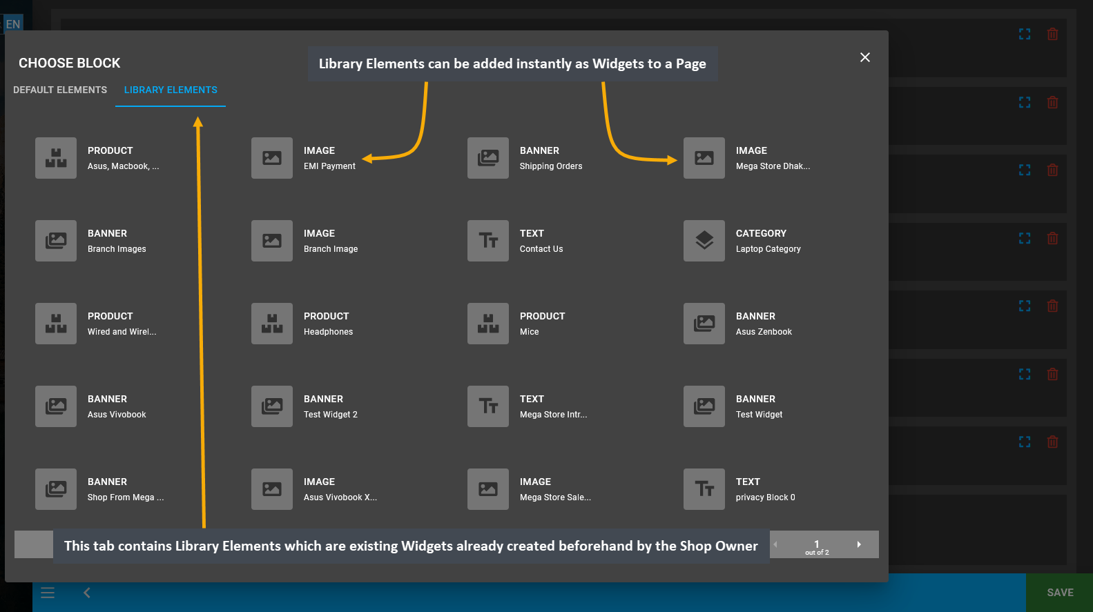
Therefore, click on each of Widget Block types to add them as New Widgets for the Page. There is another tab that contains the Library Elements which are existing Widgets already created beforehand by the Shop Owner. Library Elements can be added instantly as Widgets to a Page. They were already created before from the Widgets menu.

Image 13: Add New Widgets to Page by clicking on the Add New Widget button from the bottom on the page.

Image 14: Clicking on Add New Widgets will open a pop-up with Default Elements to select for Widget Block.

Image 15: Library Elements are existing Widgets already created beforehand by Shop Owner to add on Page.
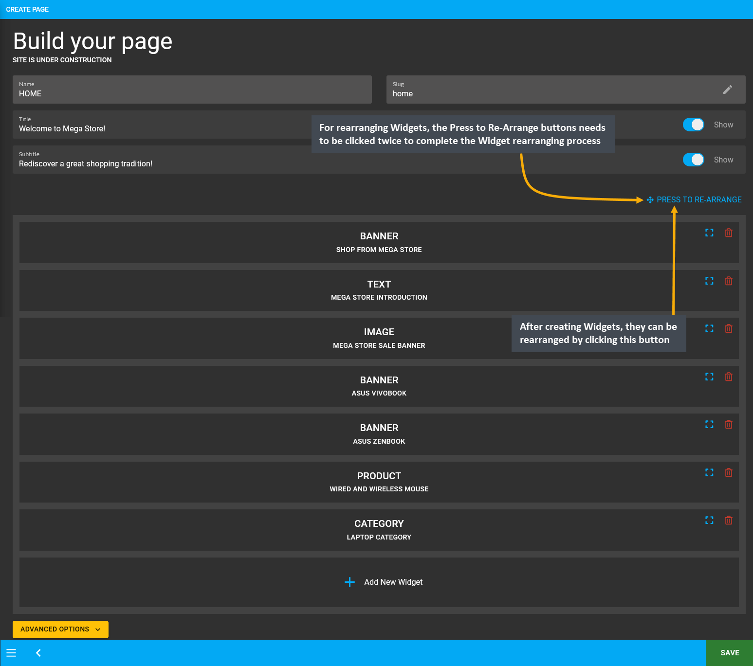
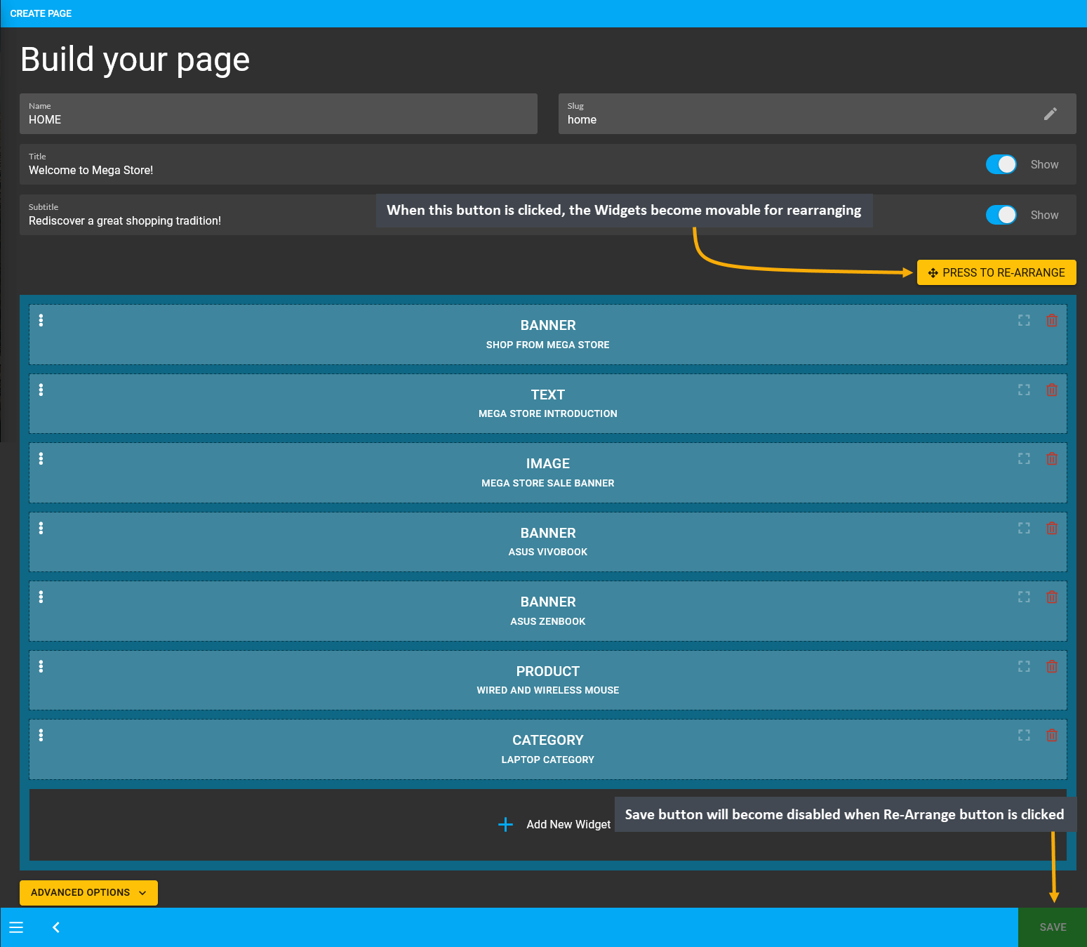
Widgets already created under a Page can be rearranged using the Press to Re-Arrange button. To rearrange the Widgets, the Press to Re-Arrange button needs to be clicked twice to complete the full Widget rearranging process. Clicking the button once will allow the Widgets to become movable for rearranging. The Save button will become disabled when the Press to Re-Arrange button is clicked. During this time, rearrange all the Widgets as needed.
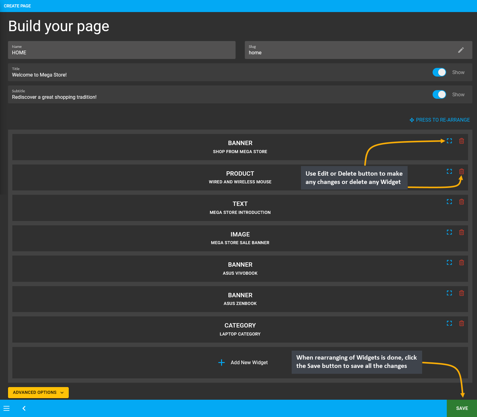
After completing the Widget rearrangement, click the Press to Re-Arrange button again for the rearranged Widgets to set in. Use the Edit or Delete button to make any changes or delete any Widget. When rearranging of Widgets is done, click the Save button and the Widgets rearrangement will be saved. Instantly, a pop-up with View button will show to view changes made on the Page. Clicking it will redirect to the Updated Page where Widgets were added.

Image 16: Click the Press to Re-Arrange button twice to complete Widget rearranging process within a Page.

Image 17: When the Press to Re-Arrange button is clicked, all the Widgets become movable for rearranging.

Image 18: Use Edit or Delete button to make changes or delete a Widget, click Save button to save changes.
Delete Widget after Removing from Page
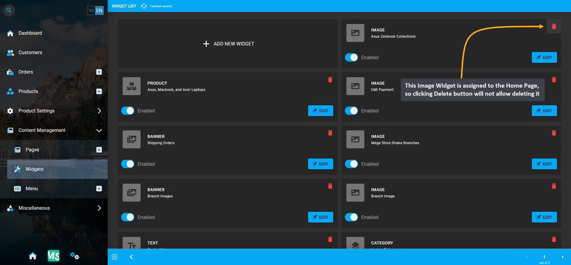
If a Widget is attached to a Page, it can only be deleted after it is removed from under the Page it is assigned. For instance, the Image Widget here is assigned to the Home Page, so clicking Delete button will not allow deleting it.

Image 19: Image Widget is assigned to the Home Page, so clicking Delete button will not allow deleting it.
So, after clicking the Delete button, a confirmation pop-up will ask if the Shop Owner wants to delete the Widget.

Image 20: After clicking Delete button, confirmation pop-up will ask if Shop Owner wants to delete Widget.
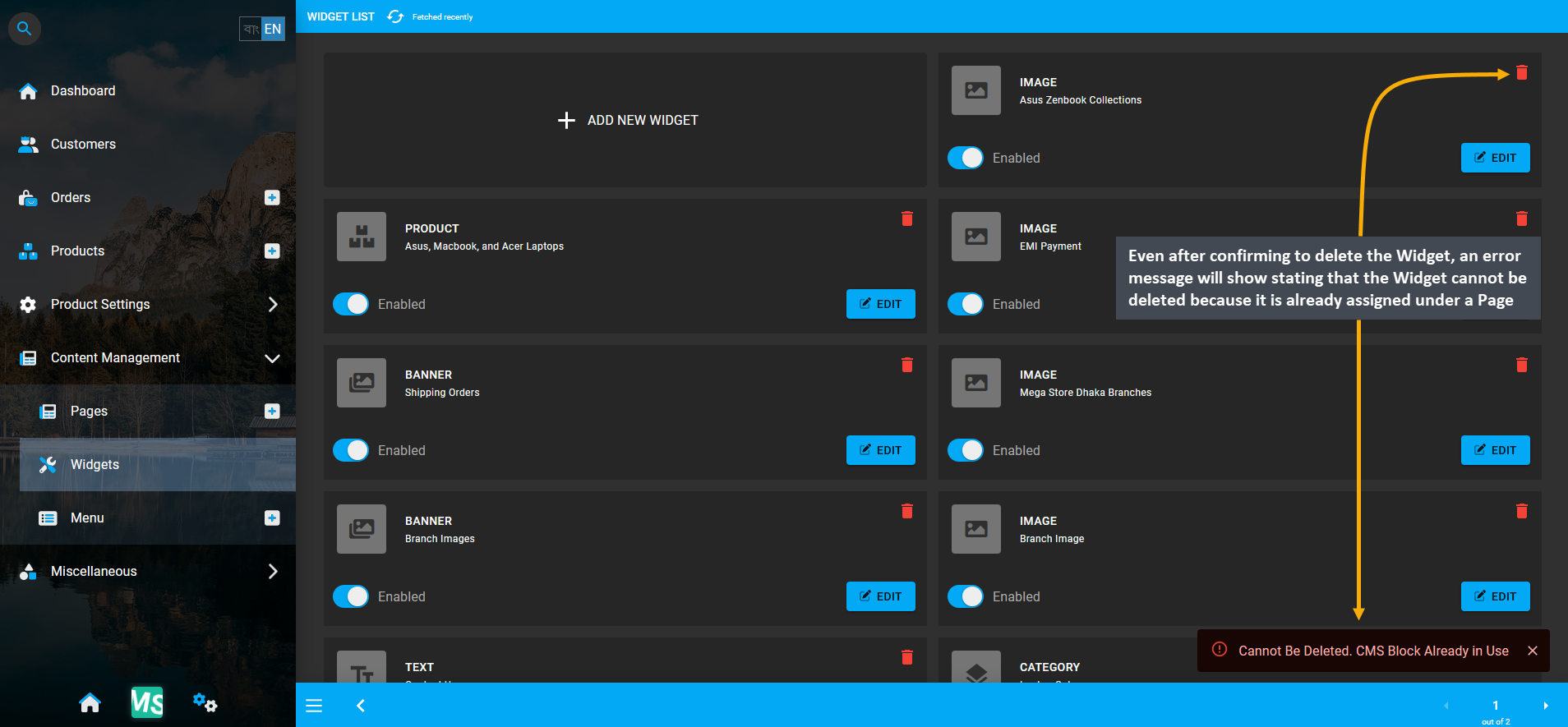
However, even after confirming to delete the Widget, an error message will show stating that the Widget or CMS Block cannot be deleted because it is already assigned under a Page. The Widget have to be removed from Page.

Image 21: Error message will state that Widget cannot be deleted as it is already assigned under a Page.
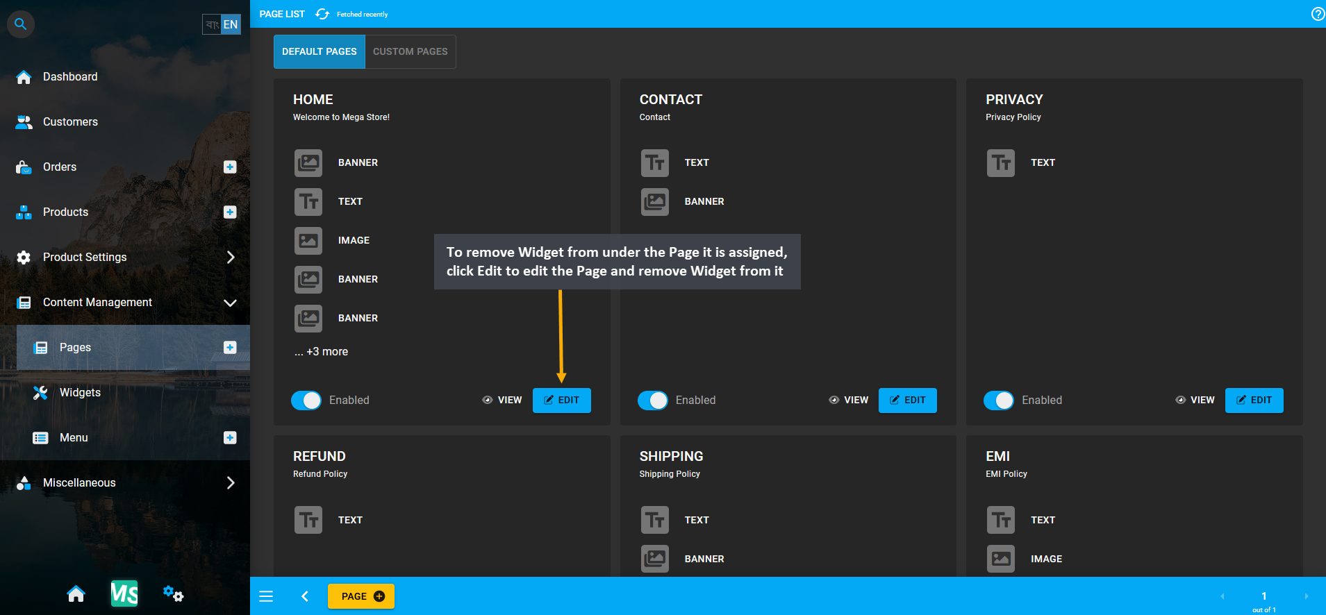
Therefore, a Widget attached to a Page can only be permanently deleted after it is removed from under the Page is it assigned. Only then, the Shop Owner can completely delete the target Widget from the list of Widgets. Thus, to remove the Widget from under the Page it is assigned, click Edit to edit the Page and remove Widget from it.

Image 22: To remove the Widget from under the Page it is assigned, Edit the Page and remove Widget from it.
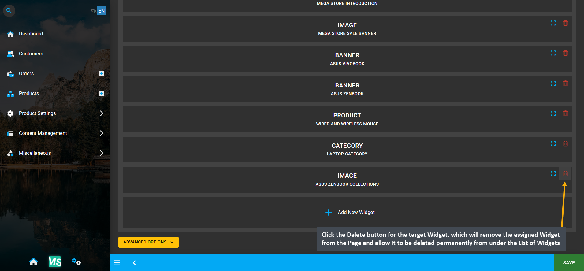
Inside the Page, click the Delete button for the target Widget that needs to be deleted. It will remove the assigned Widget from the Page and allow it to be deleted permanently from under the List of Widgets.

Image 23: Click Delete to remove assigned Widget from Page that will allow it to be deleted permanently.
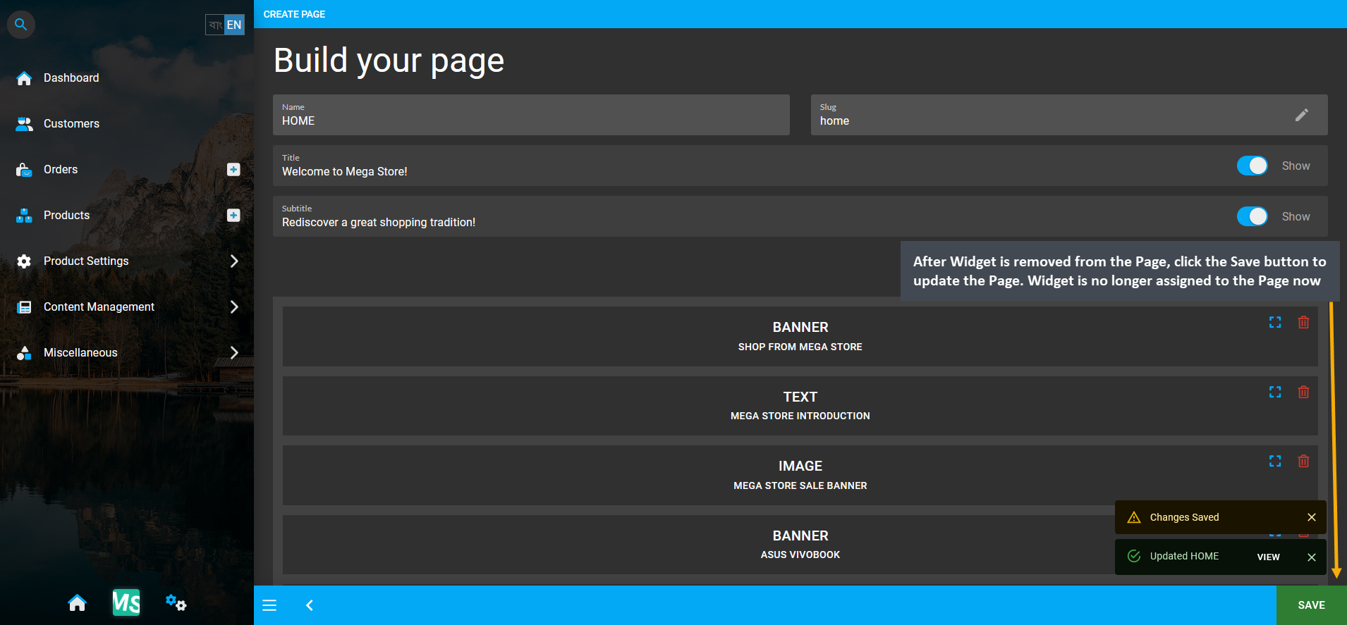
After Widget is removed from Page, click Save button to update the Page. Widget is no longer assigned to Page.

Image 24: After Widget is removed, click Save to update the Page. Widget is no longer assigned to Page.
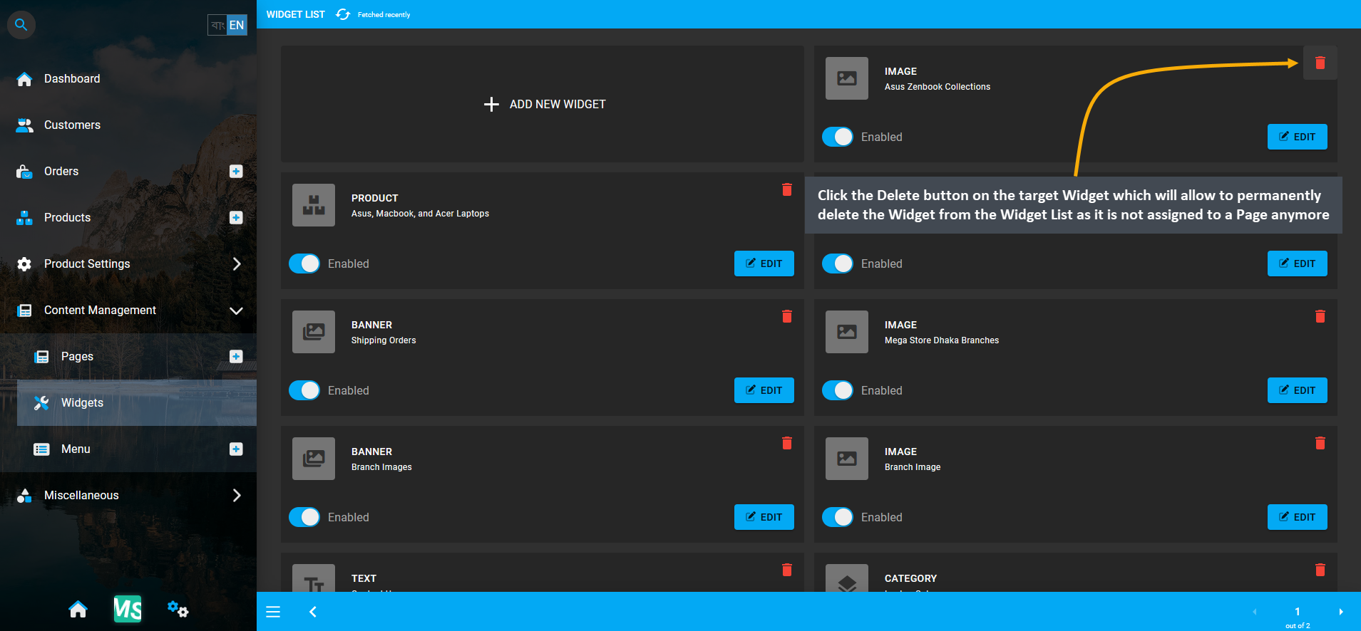
Now, go back to the Widget List Page, and click the Delete button on the target Widget. This will allow the the Shop Owner to completely delete the target Widget from the list of Widgets as it is not assigned to a Page anymore.

Image 25: Click Delete for target Widget that will allow to completely delete the Widget from Widget List.
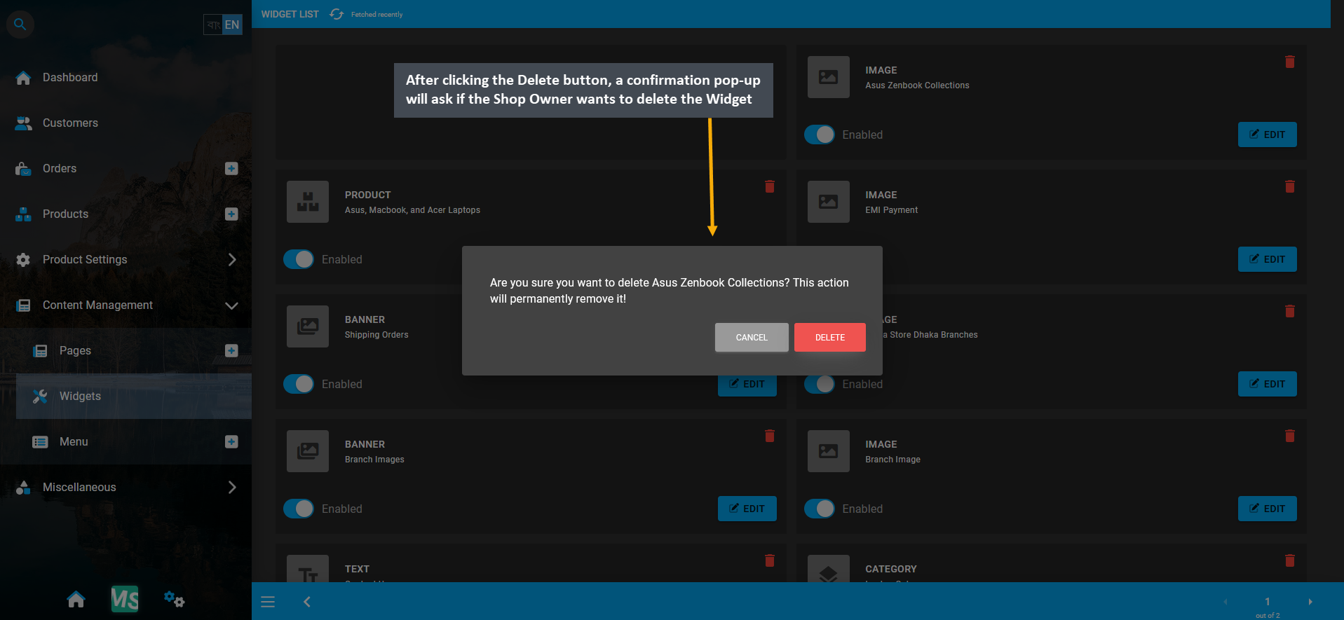
So, after clicking the Delete button, a confirmation pop-up will ask if the Shop Owner wants to delete the Widget.

Image 26: After clicking Delete button, confirmation pop-up will ask if Shop Owner wants to delete Widget.
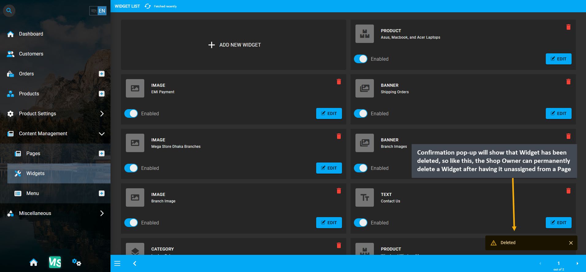
Confirmation pop-up will show that Widget has been deleted from Widget List which means that it can no longer be retrieved. In this way, Shop Owner can permanently delete a Widget after having it unassigned from a Page.

Image 27: Like this, the Shop Owner can permanently delete a Widget after having it unassigned from a Page.
4 - Text Widget
Create and manage Widgets for promoting the Shop and Products on The Website.
Text Widgets
Text Widgets can be added on different Pages of The Website to write short introductory paragraph or explain the Shop policies for Customers. Text Widgets will automatically manage several aspects like font type, font size, text style, or even Markdown format copied from another source. Shop Owners can introduce page visitors and daily Customers to their own Brand and Products by adding short background or About Us Section using Text Widgets.

Image 1: Shop Owner can add and show Title, Subtitle, Content, Call-to-Action button using the Text Widget.
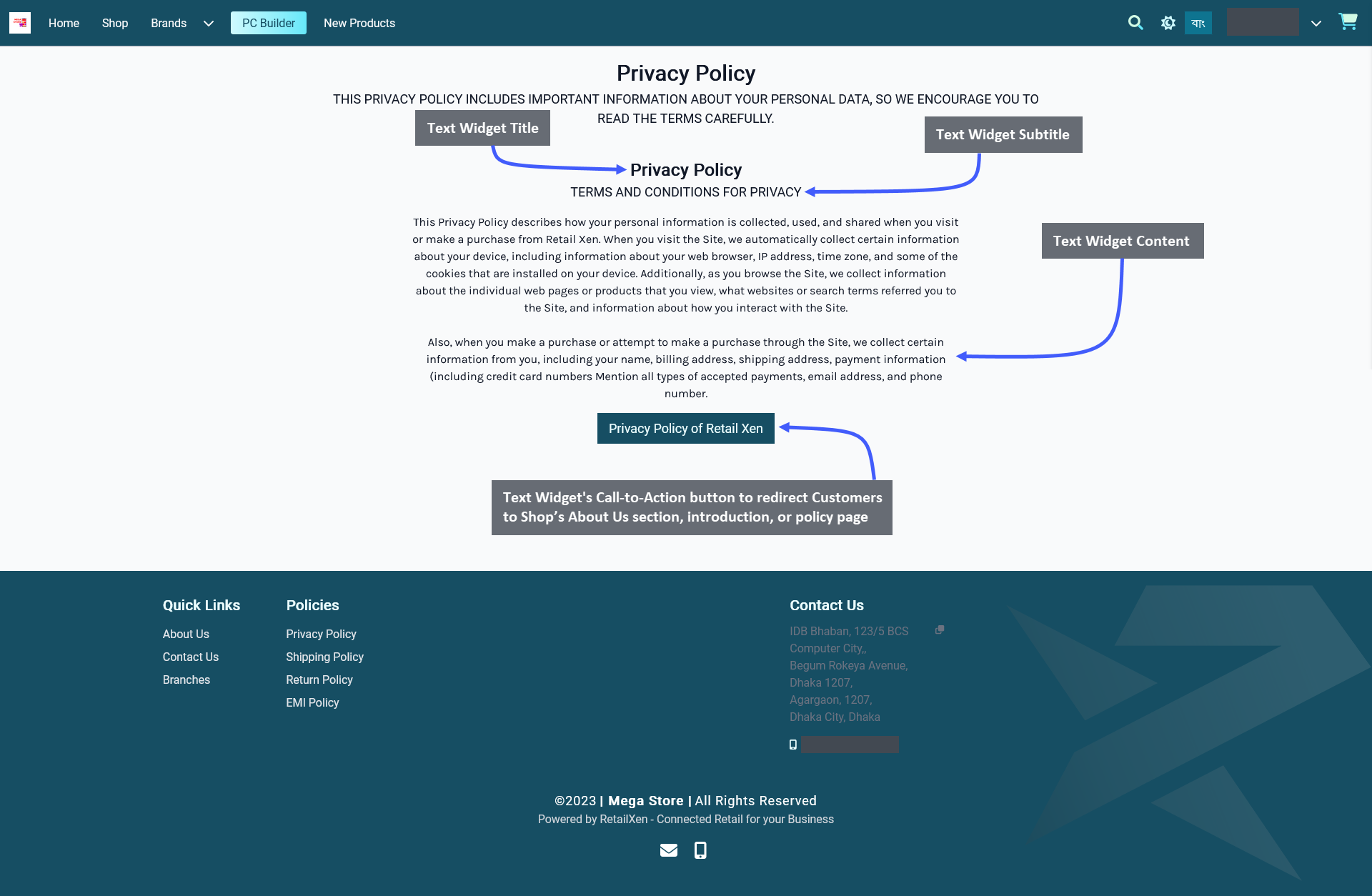
The options to setup Text Widget includes adding a Widget Name, Title, Subtitle, and Slug. There is a toggle button that can be used to enable or disable the Title or Subtitle. Enable and use the Call-to-Action button within Widget adding Button Link and Button Text to redirect Customers to Shop’s About Us section, introduction, or policy page.
Other Widget Options include the Content Box where the Shop Owner can add the main contents of Text Widget, like introduction or policies of their Shop. There is a button named All Devices which will make the Widget visible on all devices. To select specific devices, switch to Visible On and select Mobile, Table, MDPi, or HiDPi as requires. Click the Save button to save all settings. Click the Add New Widget button to add more Text Widgets within a Page.
There is a Call-to-Action Button that will redirect visitors and Customers to a Page, like a Shop’s About Us section, introduction, or policy page. Enable the Button Link (that will redirect visitors to that link) and Button Text (stating the function of the button) to be displayed. Use the toggle for Call-to-Action Button to turn it on and off.

Image 2: Shop Owner can use Text Widget to add Introduction or Policies within the Content box for display.
5 - Image Widget
Create and manage Widgets for promoting the Shop and Products on The Website.
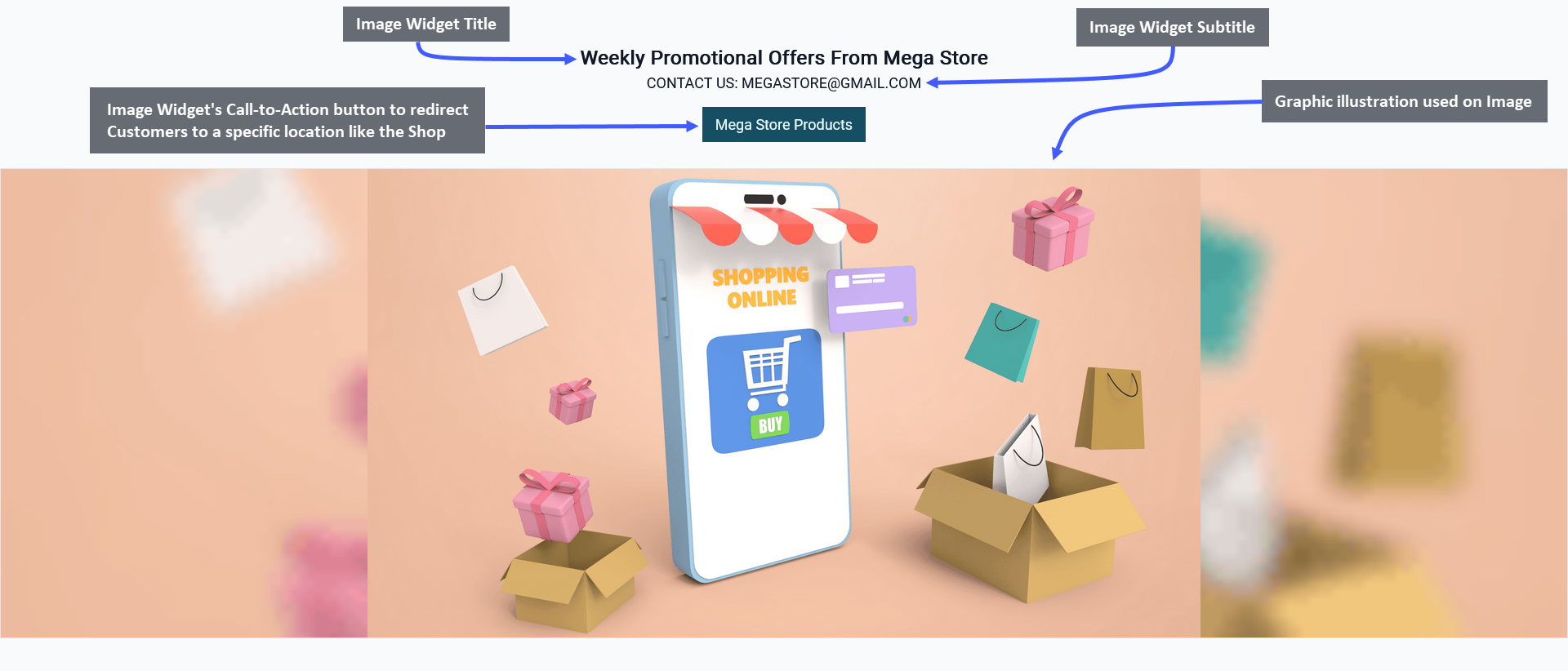
Image Widgets can be added on different Pages of The Website for adding graphic illustrations and visual contents to showcase brand logos and promotional advertisements. Shop Owners can introduce all page visitors and daily Customers to their own Brand and Products by adding colorful posters and Product images using Image Widgets.

Image 1: Shop Owner can add and show Title, Subtitle, Image, Call-to-Action button using the Image Widget.
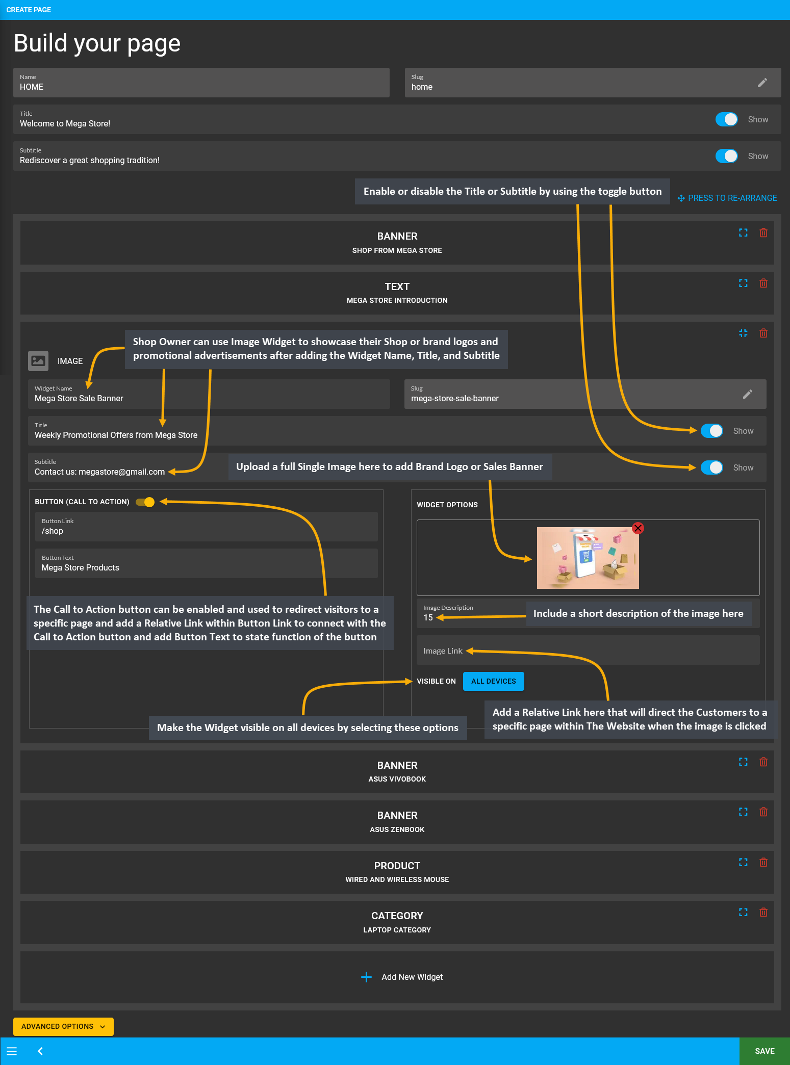
The options to setup Image Widget includes adding Widget Name, Title, Subtitle, and Slug. There is a toggle button that can be used to enable or disable the Title or Subtitle. Enable and use the Call-to-Action button within Widget adding Button Link and Button Text to redirect Customers to the Website to view the Shop Owner’s listed Products.
For Image Widget, there is option to upload a full Single Image where the Shop Owner can add their Brand Logo or Sales Banner. There is a box for Image Description where a short description of the image should be included. The Image Link should include a Relative Link that will direct the Customers to a specific page within The Website.
There is a button named All Devices which will make the Widget visible on all types of devices. Therefore, to select specific devices, switch to Visible On and select Mobile, Table, MDPi, or HiDPi as requires. Click the Save button to save all settings. Click the Add New Widget button to add more Image Widgets within a Page for Shop promotion.
There is a Call-to-Action Button that will redirect visitors and Customers to a Page, like visiting the Shop or Product page. Within the Call-to-Action Button, enable the Button Link (that will redirect visitors to that link) and Button Text (stating the function of the button) to be displayed. Use the toggle for Call-to-Action Button to turn it on and off.

Image 2: Use Image Widget to showcase brand logos and promotional advertisements for display on Website.
Functions of Fit and Fill
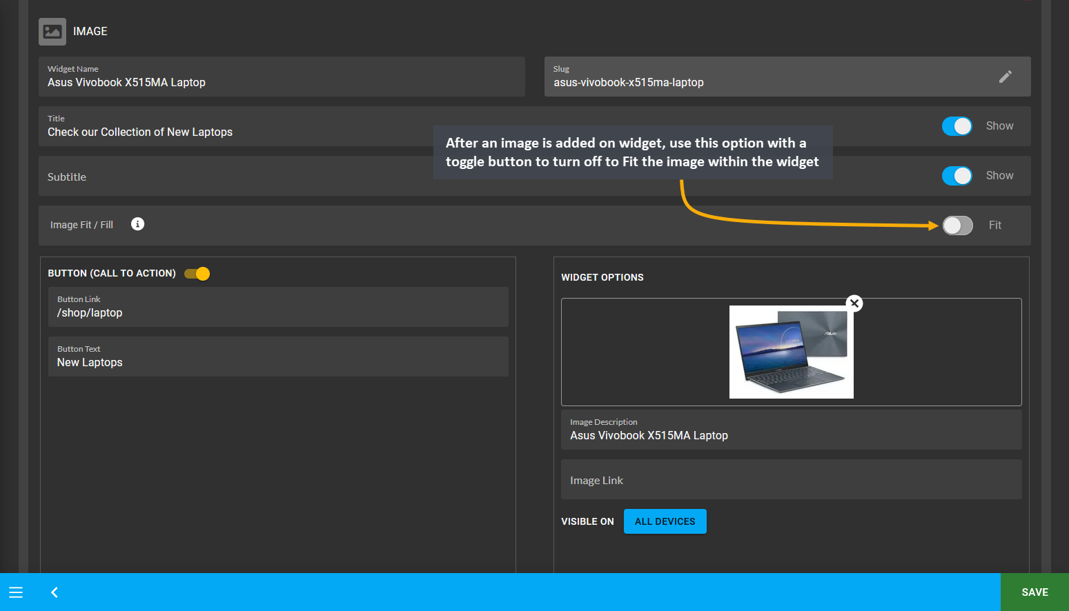
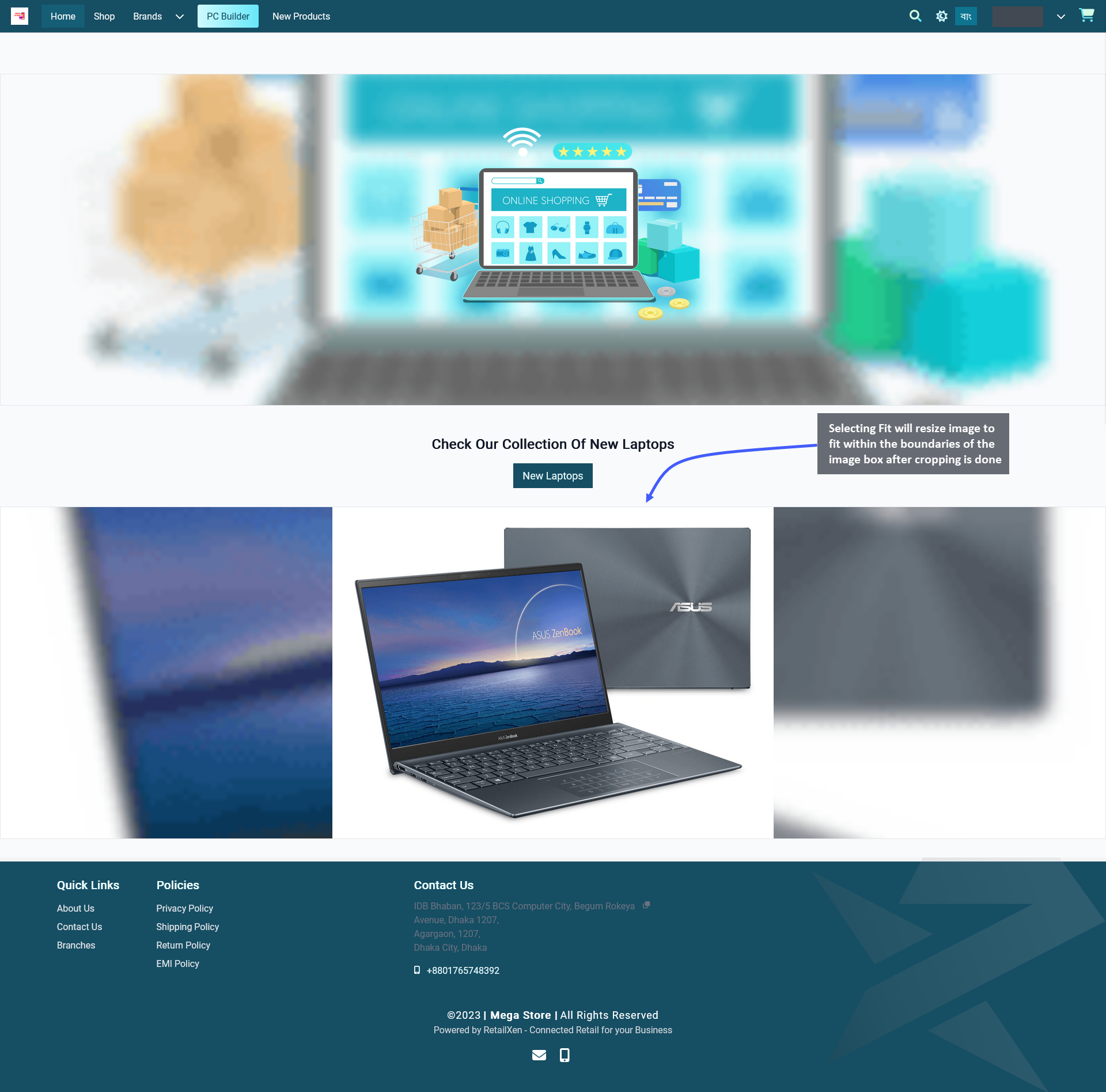
Determine how the images on Image Widget will be cropped when showing on different devices. After an image is added on the widget, there is an option called Image Fit/ Fill with a toggle button to turn on to Fill and turn off to Fit the image. Selecting Fit will resize image to fit within the boundaries of the image box after cropping is done.

Image 3: After image is added on widget, use toggle button to turn off to Fit the image within the widget.
On the Website, it can be seen that the image was cropped to fit within the boundaries of Image Widget as Fit was selected for it. In this way, the Shop Owner can add several images with Fit option. For best results, try selecting Fit for logos or images that has a square view after cropping which will specifically highlight a single Product type.

Image 4: Selecting Fit will resize image to fit within the boundaries of the widget box after the cropping.
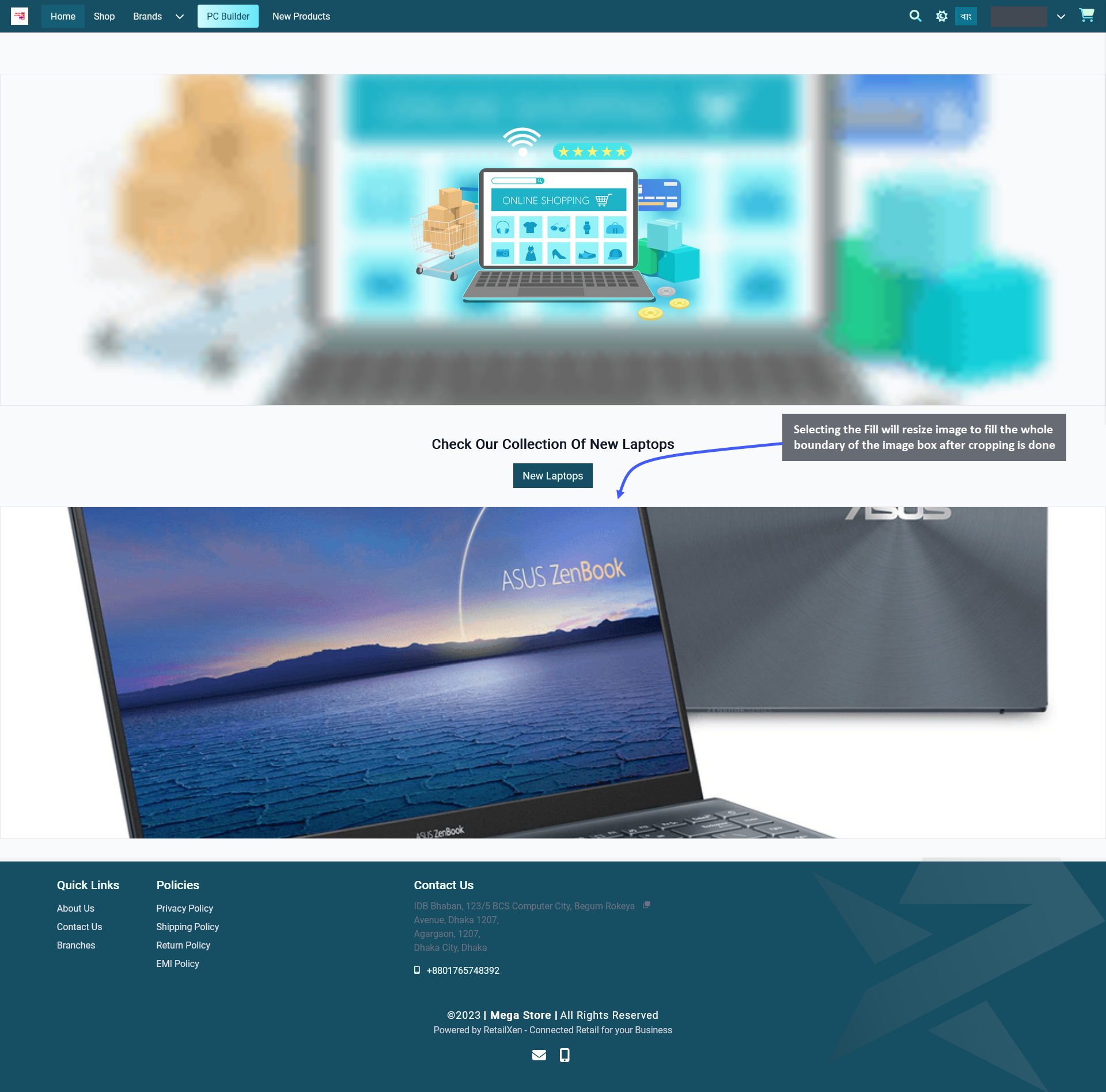
Selecting Fill will expand an image to fill the whole boundary of the image box after cropping is done. Therefore, use the toggle button to turn on Fill to show the whole cropped portion of image within the widget boundary.

Image 5: After image is added on widget, use toggle button to turn on to Fill the image within the widget.
On the Website, it can be seen that the image was cropped to fill the whole boundary of Image Widget as Fill was selected for it. In this way, the Shop Owner can add several images with Fill option. For best results, try selecting Fill for photographs or banners that will promote a group of new Products, sales offers, or special discounts.

Image 6: Selecting Fill will resize image to fill the whole boundary of the widget box after the cropping.
6 - Banner Widget
Create and manage Widgets for promoting the Shop and Products on The Website.
Shop Owners can turn shop visitors into Customers by adding Banner Widgets on The Website. They can be used for digital storytelling, like promoting brand banners, or product sales as they will add design elements to a Page. Add them on different Pages of the Website to showcase Shop or brand logos, and promotional advertisements containing graphic illustrations and visual contents. Shop Owners can introduce page visitors and Customers to their own Brand and Products by adding eye-catching Product promotions using the Banner Widgets.

Image 1: Shop Owner can add and show Title, Subtitle, Image, Call-to-Action button using the Banner Widget.
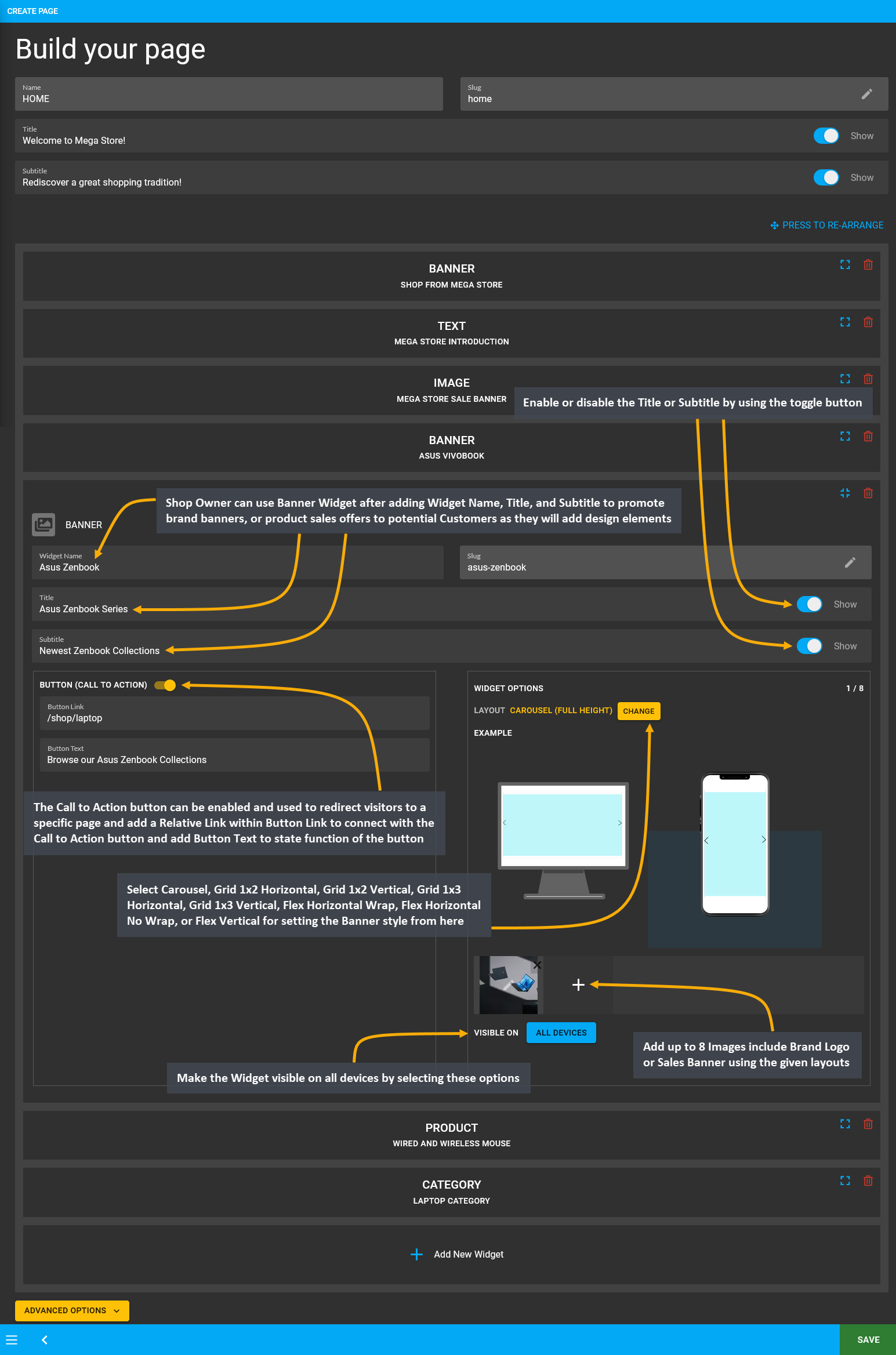
The options to setup Banner Widget includes adding Widget Name, Title, Subtitle, and Slug. There is a toggle button that can be used to enable or disable the Title or Subtitle. Enable and use the Call-to-Action button within Widget adding Button Link and Button Text to redirect Customers to the Website to view the Shop Owner’s listed Products.
Within the Banner Widget, add up to 8 Images like Brand Logo or Sales Banner with the given layouts that include Carousel, Grid 1x2 Horizontal, Grid 1x2 Vertical, Grid 1x3 Horizontal, Grid 1x3 Vertical, Flex Horizontal Wrap, Flex Horizontal No Wrap, and Flex Vertical. Enable and use the Call-to-Action button within Widget adding Button Link and Button Text to redirect Customers to the Website to view the Shop Owner’s listed Products through Banner.
There is a button named All Devices which will make the Widget visible on all types of devices. Therefore, to select specific devices, switch to Visible On and select Mobile, Table, MDPi, or HiDPi as requires. Click the Save button to save all settings. Click the Add New Widget button to add more Banner Widgets within a Page for Shop promotion.
There is a Call-to-Action Button that will redirect visitors and Customers to a Page, like visiting the Shop or Product page. Within the Call-to-Action Button, enable the Button Link (that will redirect visitors to that link) and Button Text (stating the function of the button) to be displayed. Use the toggle for Call-to-Action Button to turn it on and off.

Image 2: Use Banner Widget to promote Brand banners, or Product sales offers to the potential Customers.
Banner Image Settings
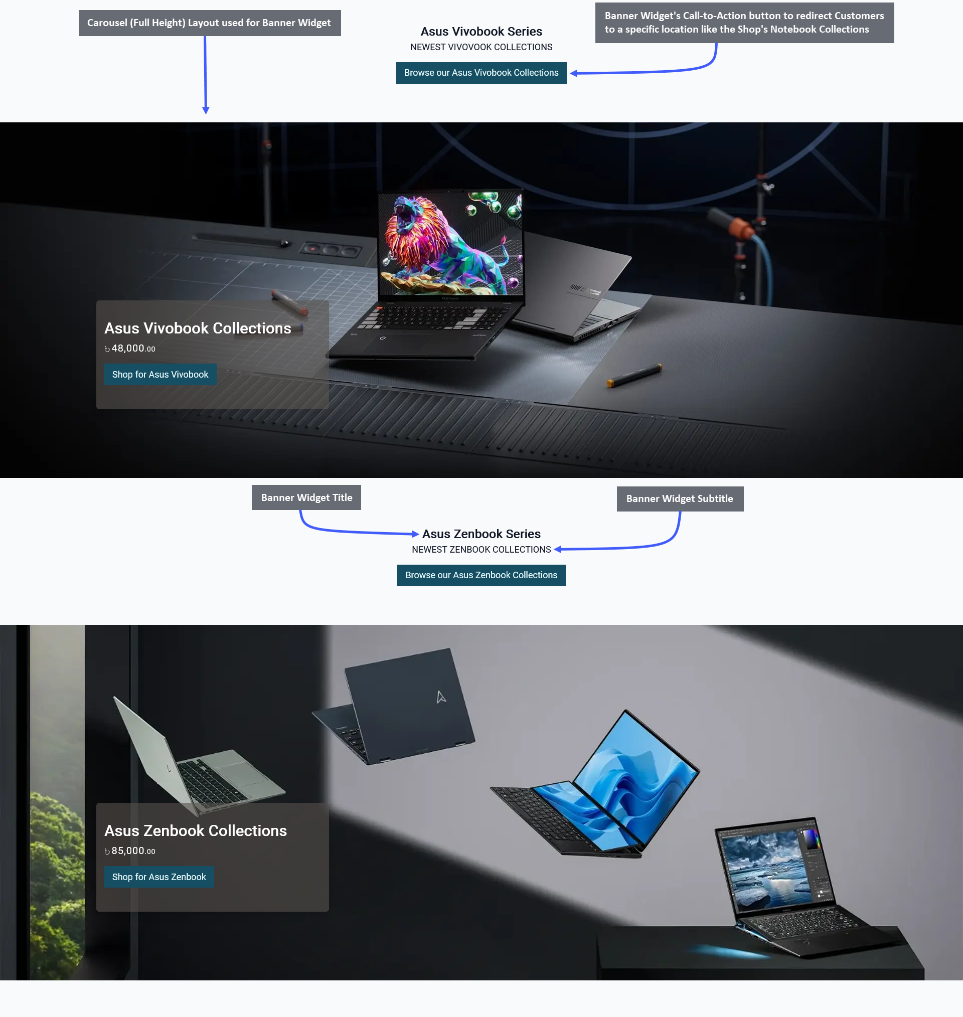
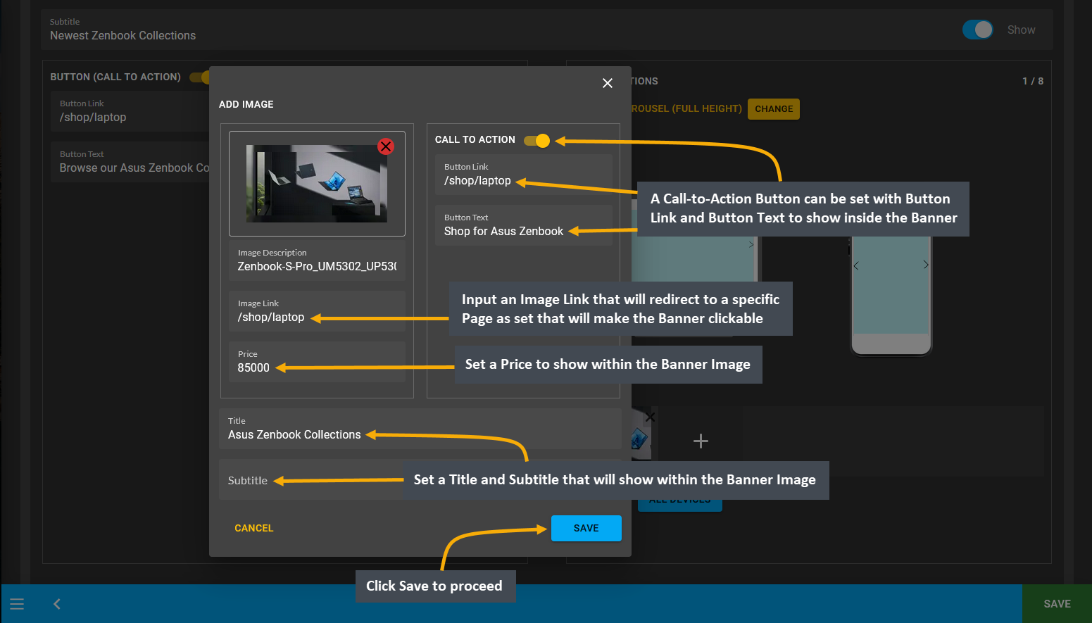
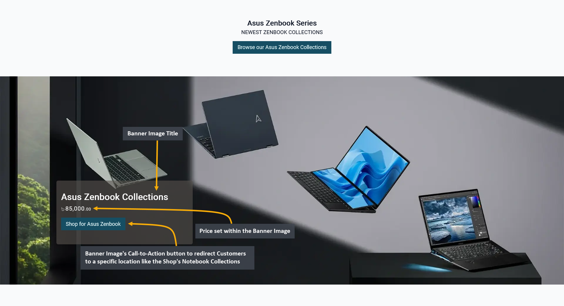
When Banner Widget image upload option is clicked, it opens a pop-up for Banner image settings. A Call-to-Action Button can be set with Button Link and Button Text to show inside the Banner to redirect Customers to a specific location, like the Shop’s Notebook collections. Set Image Description and an Image Link to redirect Customers to a specific Page and make the Banner Widget clickable. Set Price to display Product pricing inside the Banner above the Call-to-Action Button. Also, set a Title and Subtitle to show above price. Click Save to proceed with changes.

Image 3: Set Call-to-Action button, Image Description, Image Link, Price, Title, and inside Banner Image.

Image 4: Banner Image can have Title, Subtitle, Price, and Call-to-Action button to redirect the Customers.
7 - Product Widget
Create and manage Widgets for promoting the Shop and Products on The Website.
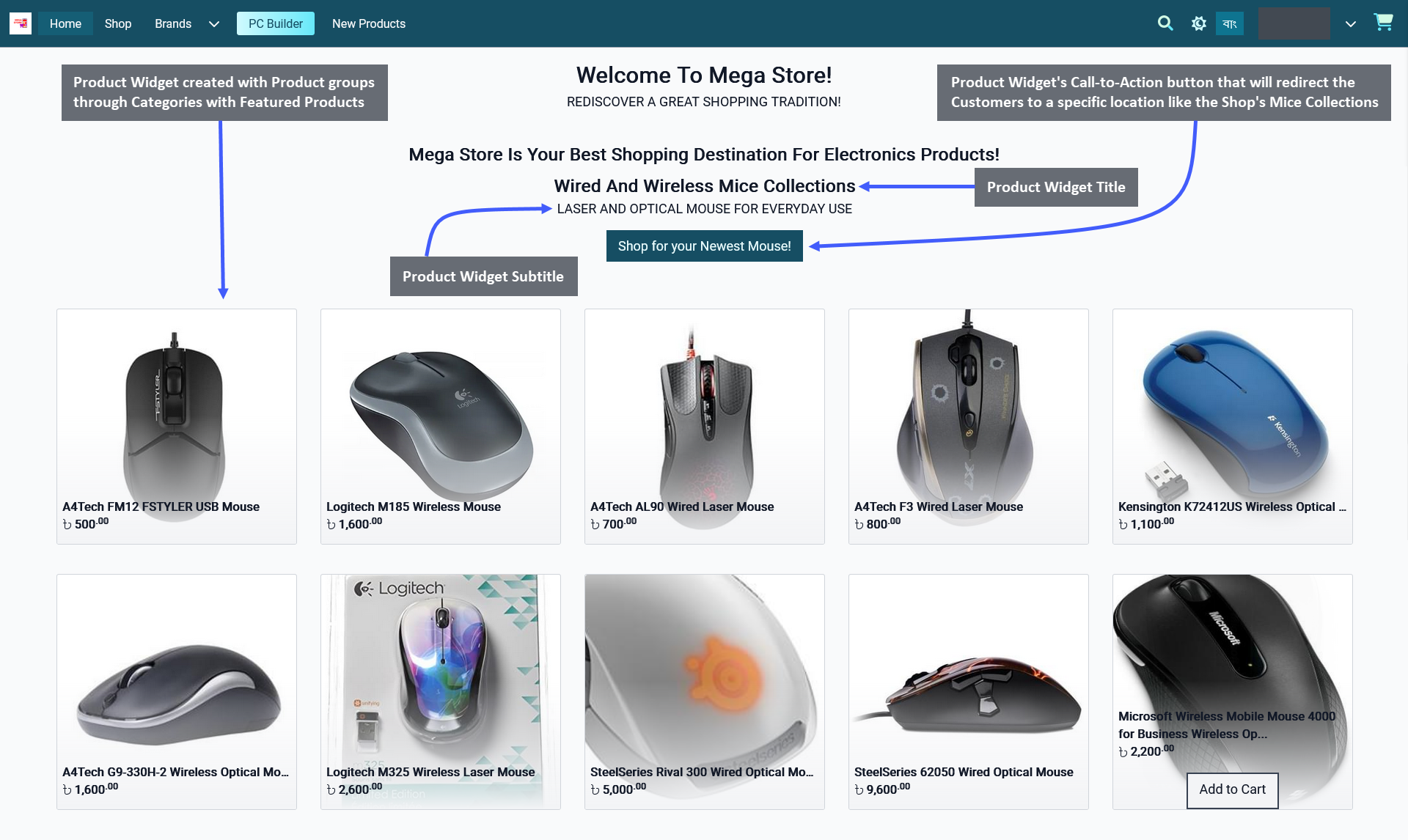
Product Widgets allow displaying specific Product groups on The Website assigned under any Category or Tag. To bring Customers’ attention to a specific batch of Products, Shop Owners can display Product Widgets. Featured Products from a specific Product Category or Tag can be advertised on the Website to boost sales for the Shop.

Image 1: Shop Owner can display Title, Subtitle, Products, and Call-to-Action button using Product Widget.
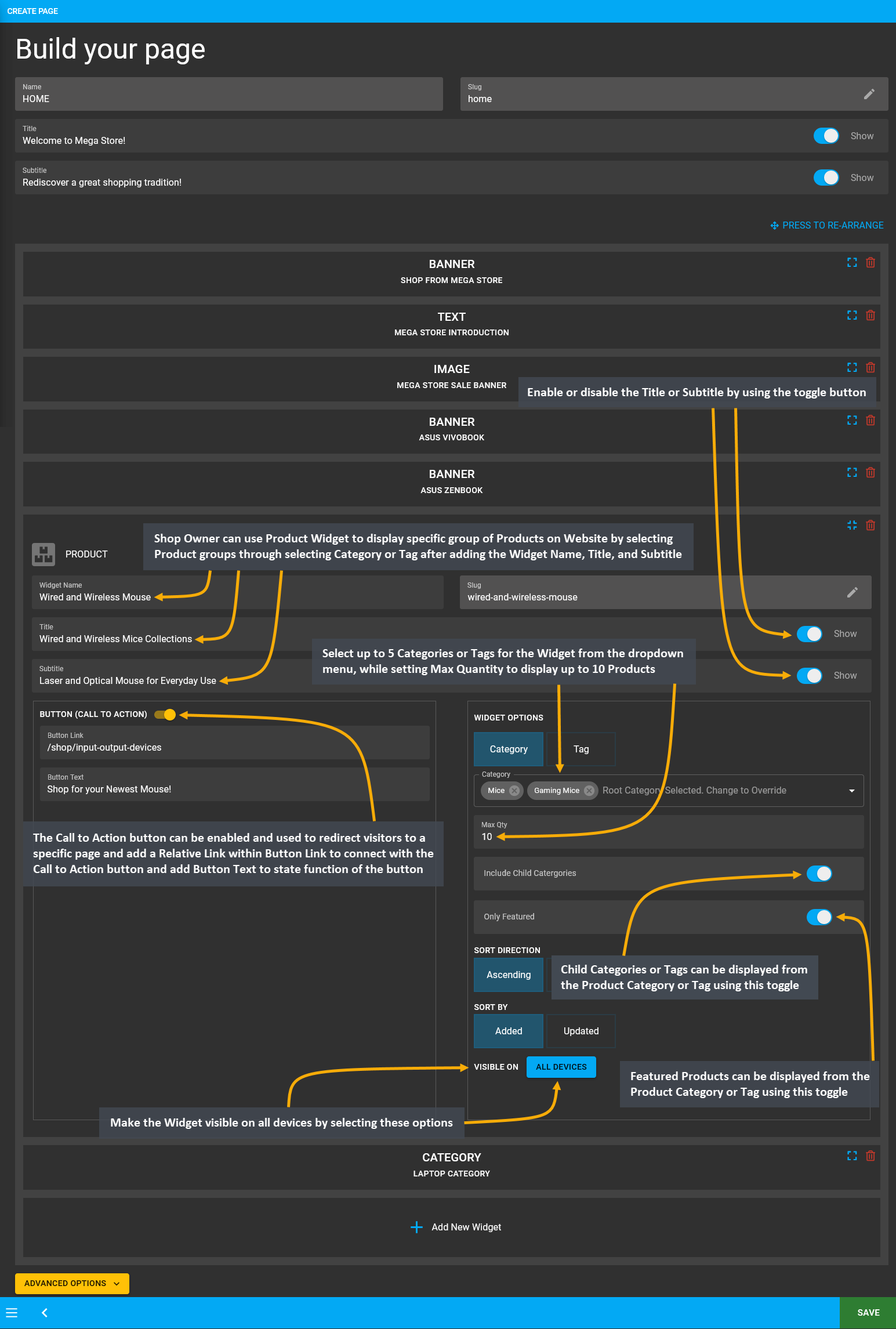
The options to setup Image Widget includes adding Widget Name, Title, Subtitle, and Slug. There is a toggle button that can be used to enable or disable the Title or Subtitle. Enable and use the Call-to-Action button within Widget adding Button Link and Button Text to redirect Customers to the Website to view the Shop Owner’s listed Products.
Select up to 5 Categories or 5 Tags for the Widget from the dropdown menu and set the Max Quantity for display up to 10 Products. Within widget options, Shop Owners can enable or disable Include Child Categories or Include Child Tags toggle to show Child Categories or Child Tags, and Only Featured toggle to show the Featured Products.
Child Categories under Categories or Child Tags under Tags can be displayed within a Product Widget by turning on the Include Child Categories or Include Child Tags toggle. Featured Products can be displayed from Product Category or Tag by turning on the Only Featured toggle. Turning off these toggles will not show the Child Categories, Tags, or Featured Products. Select the Sort Direction as Ascending or Descending and the Sort By as Added or Updated.
There is a button named All Devices which will make the Widget visible on all devices. To select any specific device, switch to Visible On and select Mobile, Table, MDPi, or HiDPi as requires. Click the Save button to save all settings. Click the Add New Widget button to add more Product Widgets within a Default or Custom Page.
There is a Call-to-Action Button that will redirect visitors and Customers to a Page, like visiting the Shop or Product page. Within the Call-to-Action Button, enable the Button Link (that will redirect visitors to that link) and Button Text (stating the function of the button) to be displayed. Use the toggle for Call-to-Action Button to turn it on and off.

Image 2: Use Product Widget to display any Product group on The Website assigned under any Category or Tag.
8 - Category Widget
Create and manage Widgets for promoting the Shop and Products on The Website.
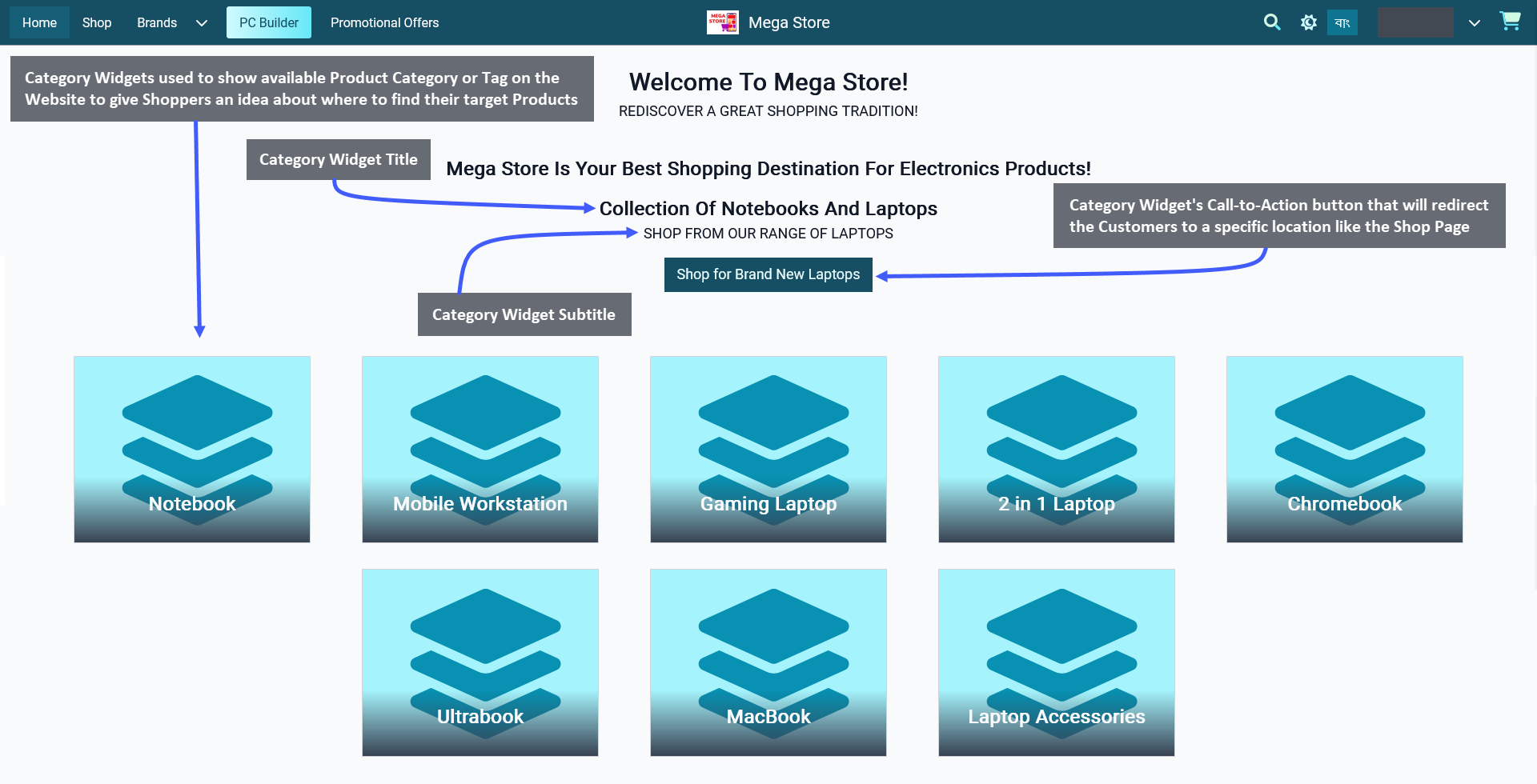
Display target Product Categories on The Website through Category Widgets. Customers can easily click on these Category Widgets to shop for Products under those Categories. Category Widgets can be used to show available Product Category or Tag on the Website that will give Shoppers an idea about where to find their target Products within Categories or Tags. Clicking on a Category will redirect Customers to its Product groups on the Shop.

Image 1: Display Title, Subtitle, Categories, or Tags, and Call-to-Action button using the Category Widget.
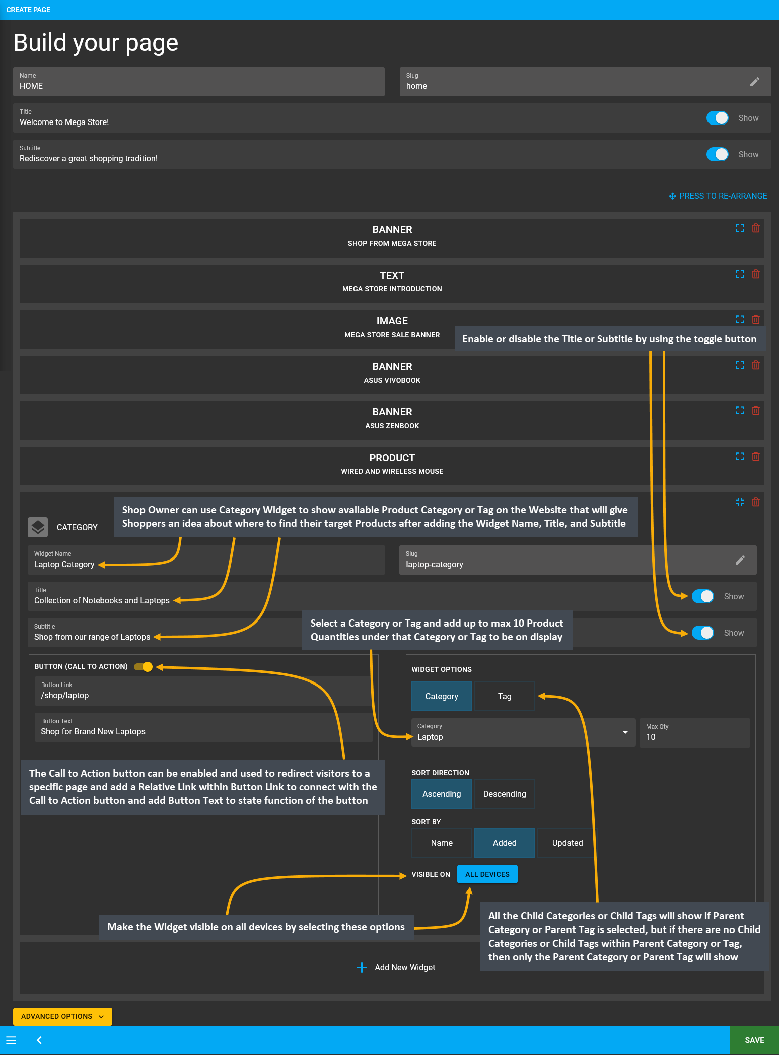
The options to setup Category Widget includes adding Widget Name, Title, Subtitle, and Slug. Use the toggle button to enable or disable the Title or Subtitle. Enable and use the Call-to-Action button within Widget adding Button Link and Button Text to redirect Customers to the Website to view the Shop Owner’s listed Categories.
Category Widgets can be used to show Product Category or Tag on Website. Select a Category or Tag and add up to maximum 10 Quantities of Products under that Category or Tag to be on display. All the Child Categories or Child Tags will show if the Parent Category or Parent Tag is selected. However, if there are no Child Categories or Child Tags within the Parent Category or Parent Tag, then only the Parent Category or Parent Tag will show on Website.
From the Website example, it can be seen that several Child Categories that are assigned under the Main Laptop Category are being displayed. Select the Sort Direction as Ascending or Descending and Sort By as Name, Added, or Updated from the Category Widget setup option to display Categories or Tags under this widget.
There is a button named All Devices which will make the Widget visible on all types of devices. Therefore, to select specific devices, switch to Visible On and select Mobile, Table, MDPi, or HiDPi as requires. Click the Save button to save all settings. Click the Add New Widget button to add more Category Widgets within a Page for Shop promotion.
There is a Call-to-Action Button that will redirect visitors and Customers to a Page, like visiting the Shop or Product page. Within the Call-to-Action Button, enable the Button Link (that will redirect visitors to that link) and Button Text (stating the function of the button) to be displayed. Use the toggle for Call-to-Action Button to turn it on and off.

Image 2: Use Category Widget to show available Product groups within Product Category or Tag on Website.
