Image Widget
Image Widgets
Image Widgets can be added on different Pages of The Website for adding graphic illustrations and visual contents to showcase brand logos and promotional advertisements. Shop Owners can introduce all page visitors and daily Customers to their own Brand and Products by adding colorful posters and Product images using Image Widgets.
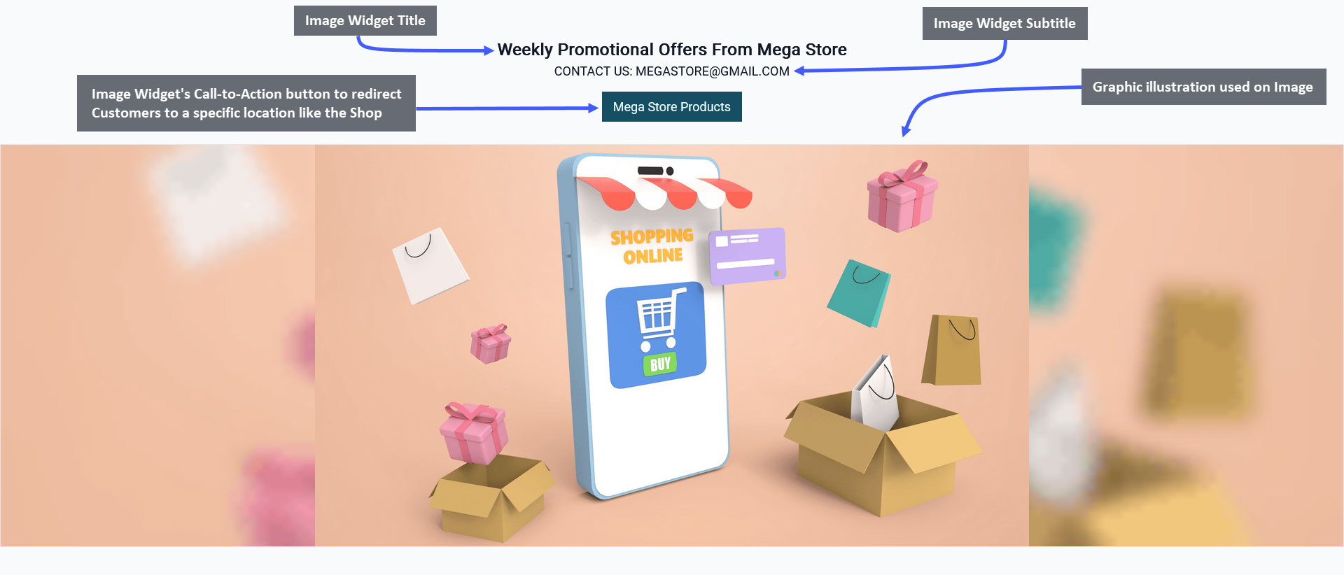
Image 1: Shop Owner can add and show Title, Subtitle, Image, Call-to-Action button using the Image Widget.
Widget Setup Options
The options to setup Image Widget includes adding Widget Name, Title, Subtitle, and Slug. There is a toggle button that can be used to enable or disable the Title or Subtitle. Enable and use the Call-to-Action button within Widget adding Button Link and Button Text to redirect Customers to the Website to view the Shop Owner’s listed Products.
For Image Widget, there is option to upload a full Single Image where the Shop Owner can add their Brand Logo or Sales Banner. There is a box for Image Description where a short description of the image should be included. The Image Link should include a Relative Link that will direct the Customers to a specific page within The Website.
There is a button named All Devices which will make the Widget visible on all types of devices. Therefore, to select specific devices, switch to Visible On and select Mobile, Table, MDPi, or HiDPi as requires. Click the Save button to save all settings. Click the Add New Widget button to add more Image Widgets within a Page for Shop promotion.
Call-To-Action Button
There is a Call-to-Action Button that will redirect visitors and Customers to a Page, like visiting the Shop or Product page. Within the Call-to-Action Button, enable the Button Link (that will redirect visitors to that link) and Button Text (stating the function of the button) to be displayed. Use the toggle for Call-to-Action Button to turn it on and off.
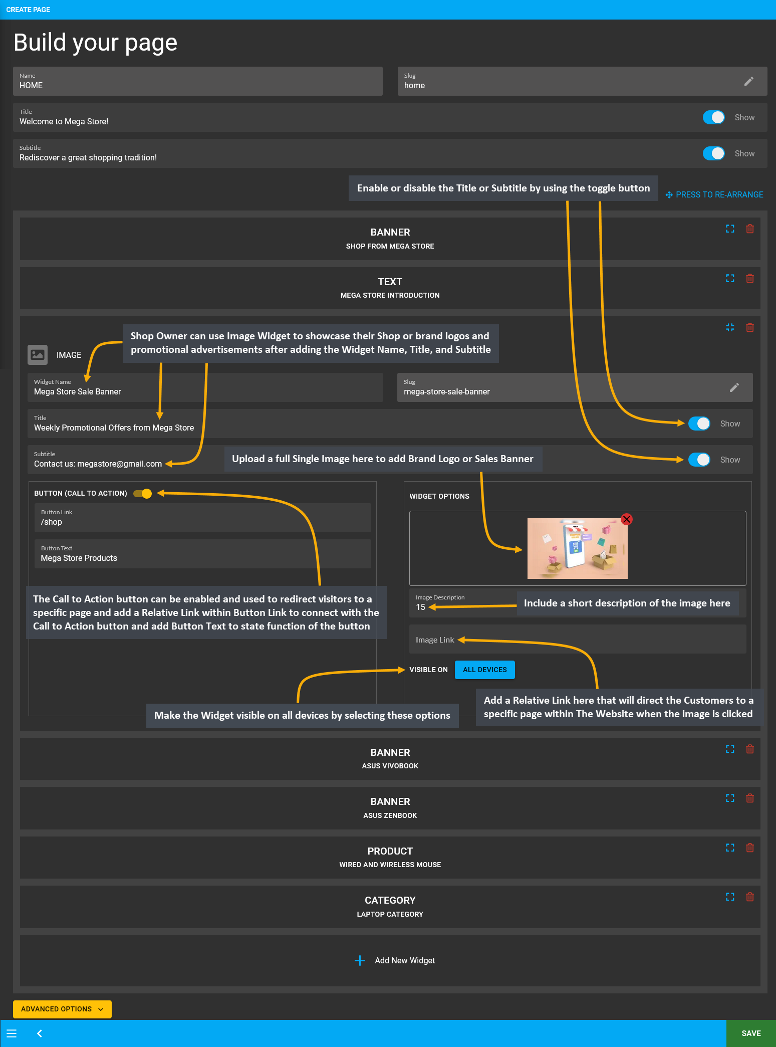
Image 2: Use Image Widget to showcase brand logos and promotional advertisements for display on Website.
Functions of Fit and Fill
Determine how the images on Image Widget will be cropped when showing on different devices. After an image is added on the widget, there is an option called Image Fit/ Fill with a toggle button to turn on to Fill and turn off to Fit the image. Selecting Fit will resize image to fit within the boundaries of the image box after cropping is done.
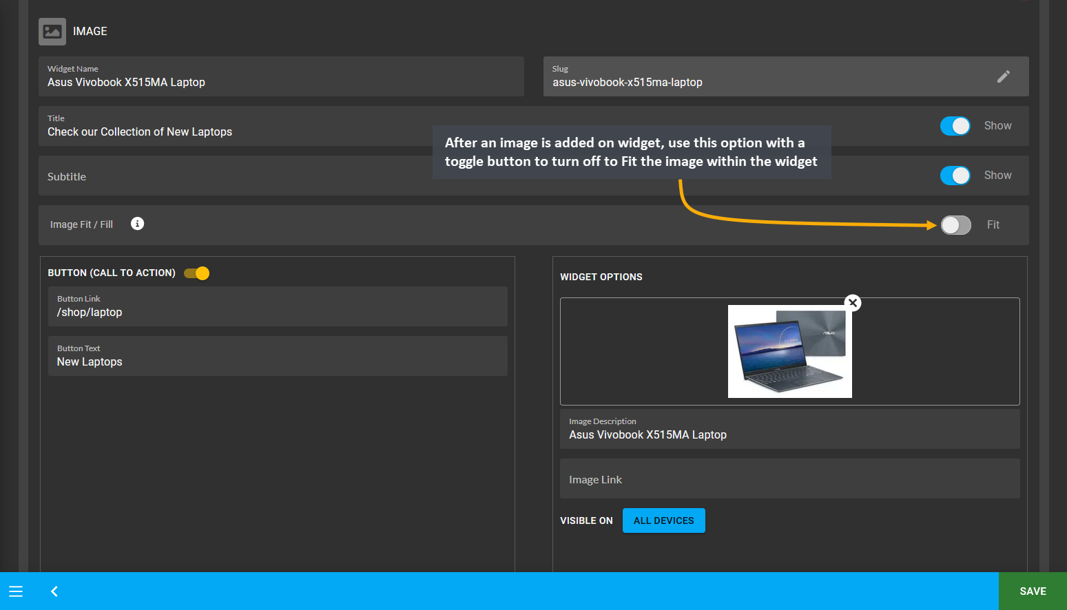
Image 3: After image is added on widget, use toggle button to turn off to Fit the image within the widget.
On the Website, it can be seen that the image was cropped to fit within the boundaries of Image Widget as Fit was selected for it. In this way, the Shop Owner can add several images with Fit option. For best results, try selecting Fit for logos or images that has a square view after cropping which will specifically highlight a single Product type.
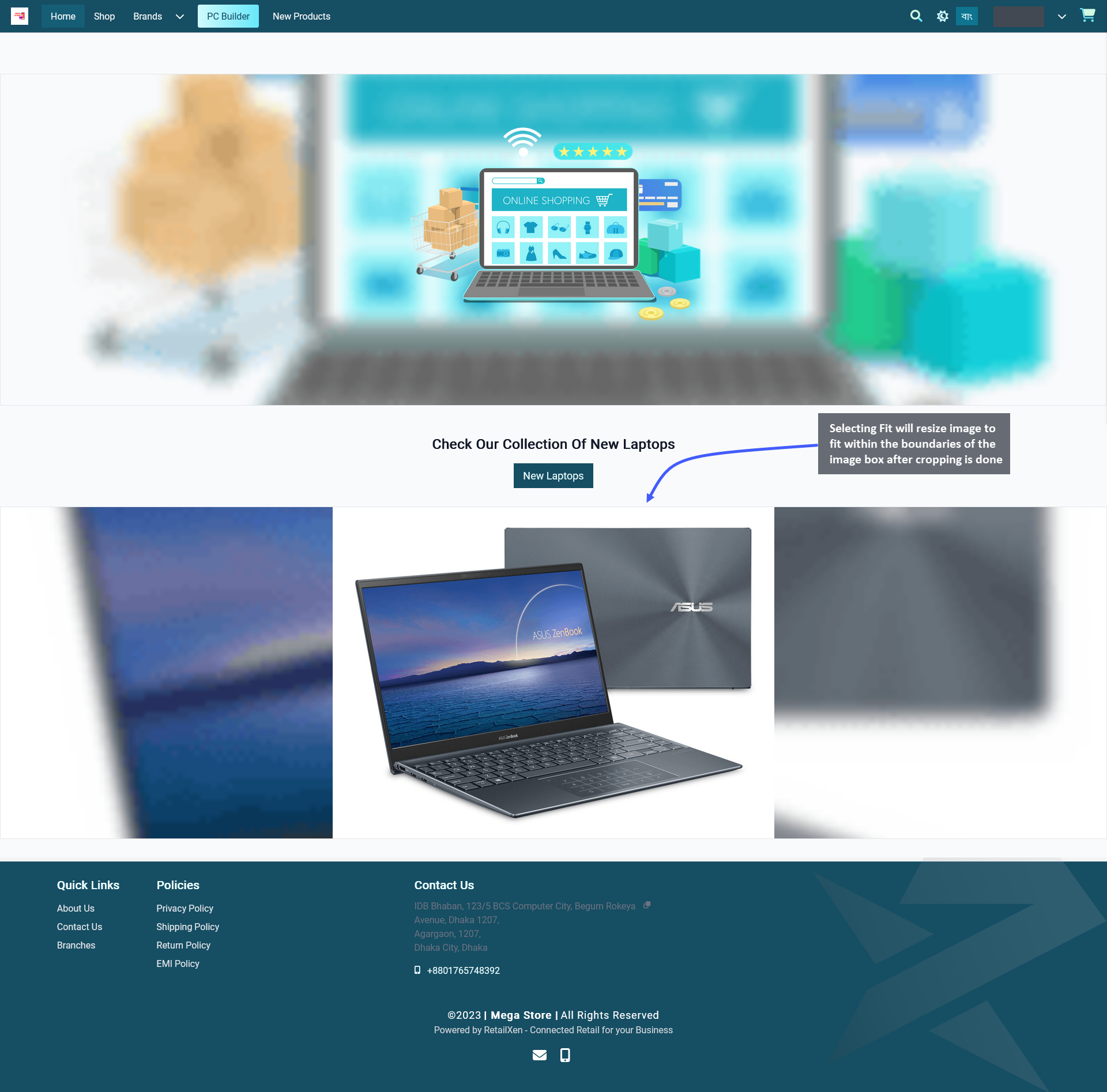
Image 4: Selecting Fit will resize image to fit within the boundaries of the widget box after the cropping.
Selecting Fill will expand an image to fill the whole boundary of the image box after cropping is done. Therefore, use the toggle button to turn on Fill to show the whole cropped portion of image within the widget boundary.

Image 5: After image is added on widget, use toggle button to turn on to Fill the image within the widget.
On the Website, it can be seen that the image was cropped to fill the whole boundary of Image Widget as Fill was selected for it. In this way, the Shop Owner can add several images with Fill option. For best results, try selecting Fill for photographs or banners that will promote a group of new Products, sales offers, or special discounts.
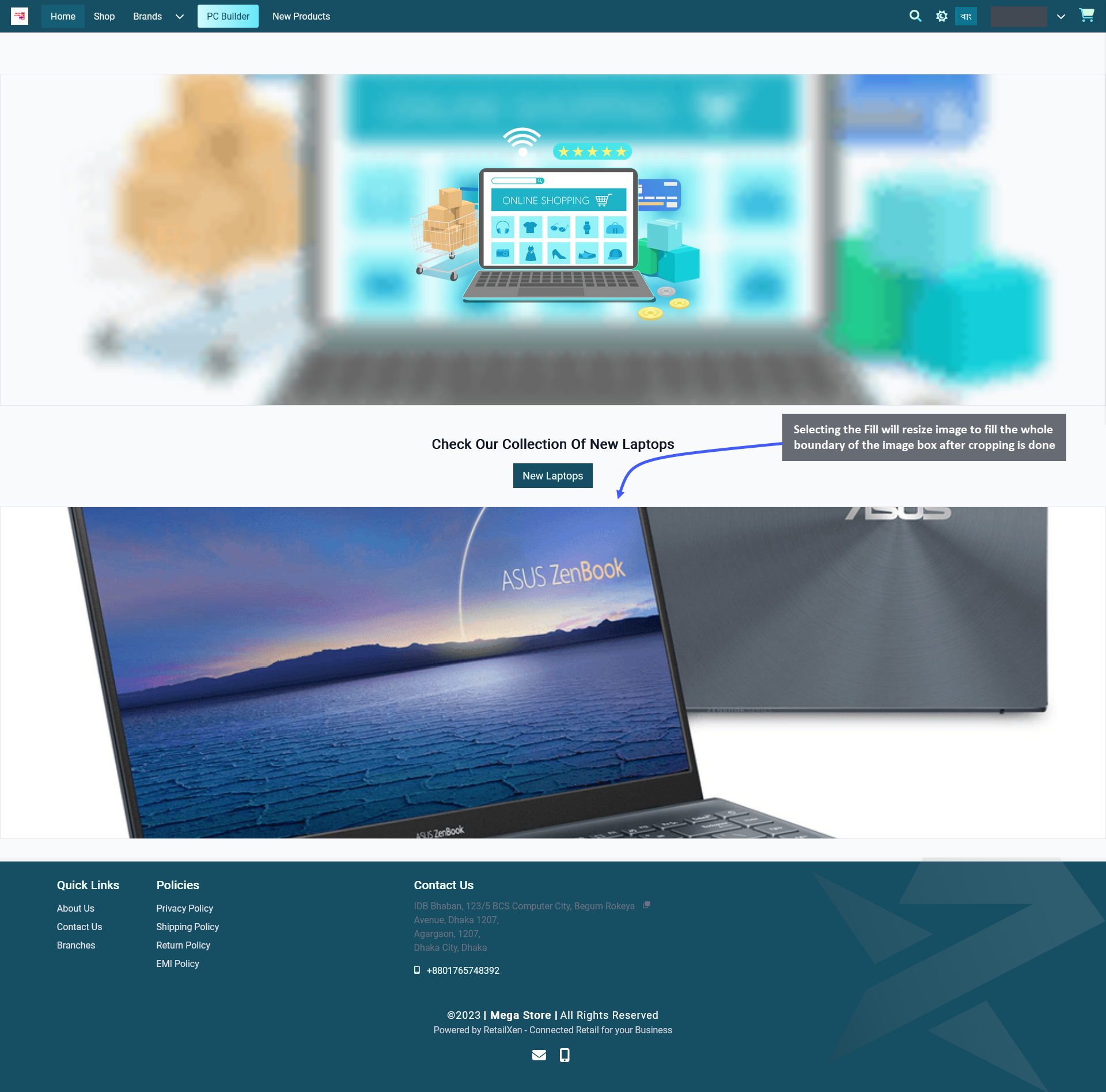
Image 6: Selecting Fill will resize image to fill the whole boundary of the widget box after the cropping.